
You could have the greatest podcast in the world. However, if you aren’t doing effective marketing for your show, it may be difficult to grow your listener base at first.
Creating a compelling landing page for your podcast is an excellent first step. A landing page can help to educate your audience on what your show is about, collect email subscribers, and most importantly, prompt people to subscribe to your show.
However, in order to ensure that you are creating an eye catching, aesthetically pleasing landing page with compelling copy, it can be helpful to refer to well-designed landing pages of successful shows.
In this post you can discover 17 highly effective podcast landing page examples for inspiration.
1. The Newsworthy

The Newsworthy podcast doesn’t overwhelm you with information when you click on the landing page. A simple straightforward headline tells you exactly what you’re going to get: News made “fast, fair, fun”, in ten minutes. It’s this clean and simplistic approach that indicates what you can expect from the full podcast experience.
The coloring is crisp and clean on this website, which helps to add to its authority, plus, you get the extra dose of credibility afforded by quotes from brands like Fast Company. We particularly like that there are multiple ways to listen, including Spotify, Google Podcasts, Apple Podcasts, and more. Alternatively, you can just start an episode right there on the landing page.
2. Food Psych Podcast
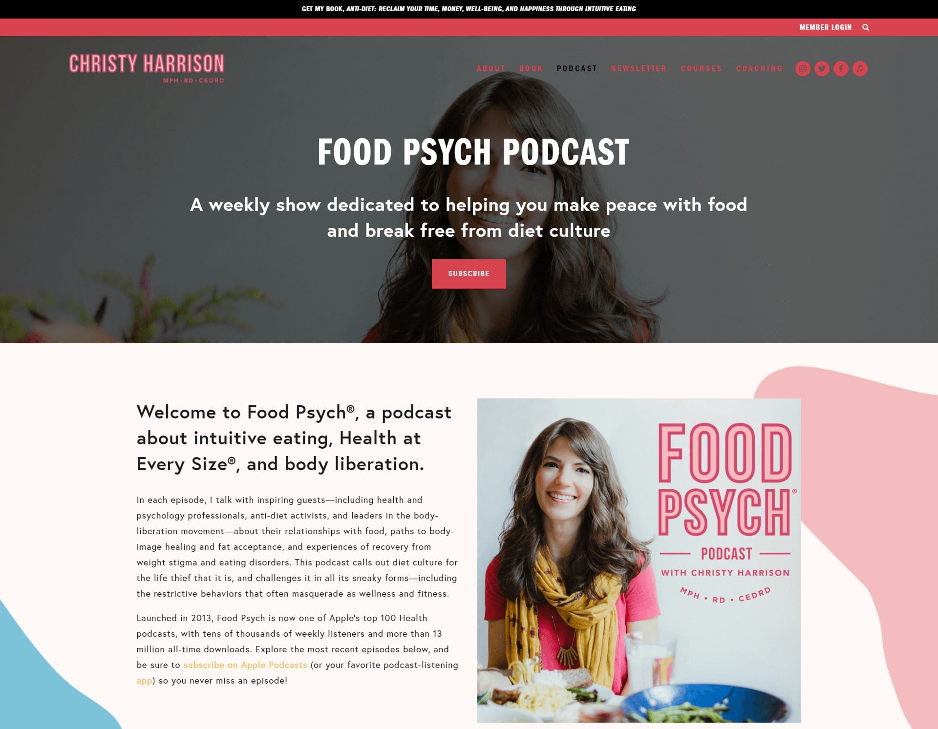
We’re drawn in by the background image for this podcast, featuring a smiling woman enjoying an amazing meal. The real, human image reminds you that you’re connecting with a genuine person here, while the high-quality resolution shows the sophistication of the production.
We love the high contrast “Subscribe” button on this landing page, as well as the simplified navigation system, intended to ensure your attention stays where it needs to be – on the page. There’s also plenty of little details demonstrating the credibility of the host, such as the “MPH.RD. CEDRD” under her name, and the “As Seen In” section with quotes from groups like the New York Times.
3. Ali on The Run
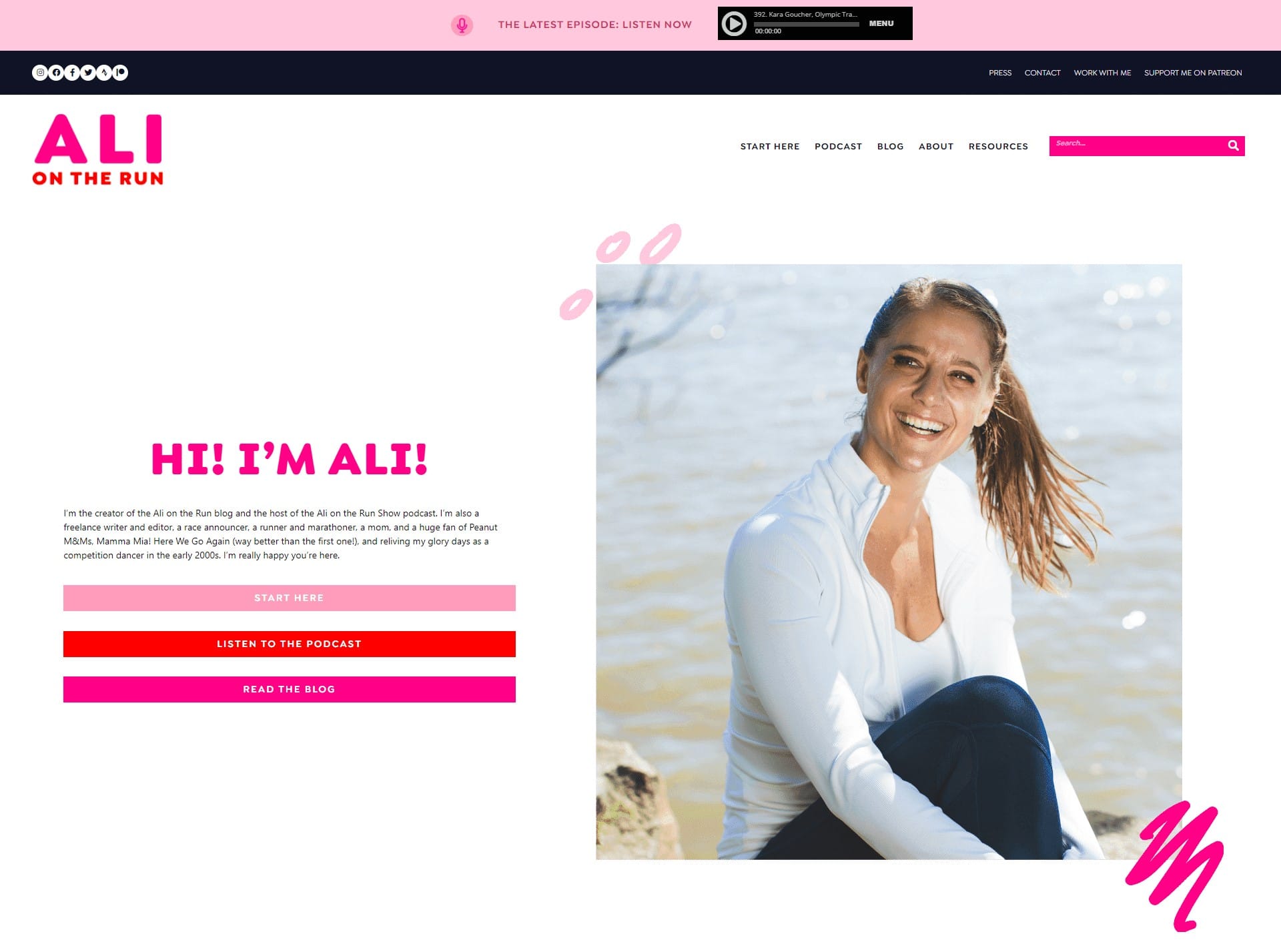
Ali, the creator of Ali on the Run, has created a beautiful bubbly-looking image with her podcast landing page. A combination of bright colors, squiggly hand-drawn shapes and a genuine human photo all make the page more compelling. You also get a wonderful introduction into who Ali is straight away, so you feel like you’re listening to someone you know.
There are a series of three CTA buttons on the top of the landing page, which allow you to choose between “Start Here”, listening to the podcast, or reading Ali’s blog. The range of options ensures Ali can appeal to all kinds of people.
Related: 23 Author Landing Pages for Inspiration
4. The Friday Habit
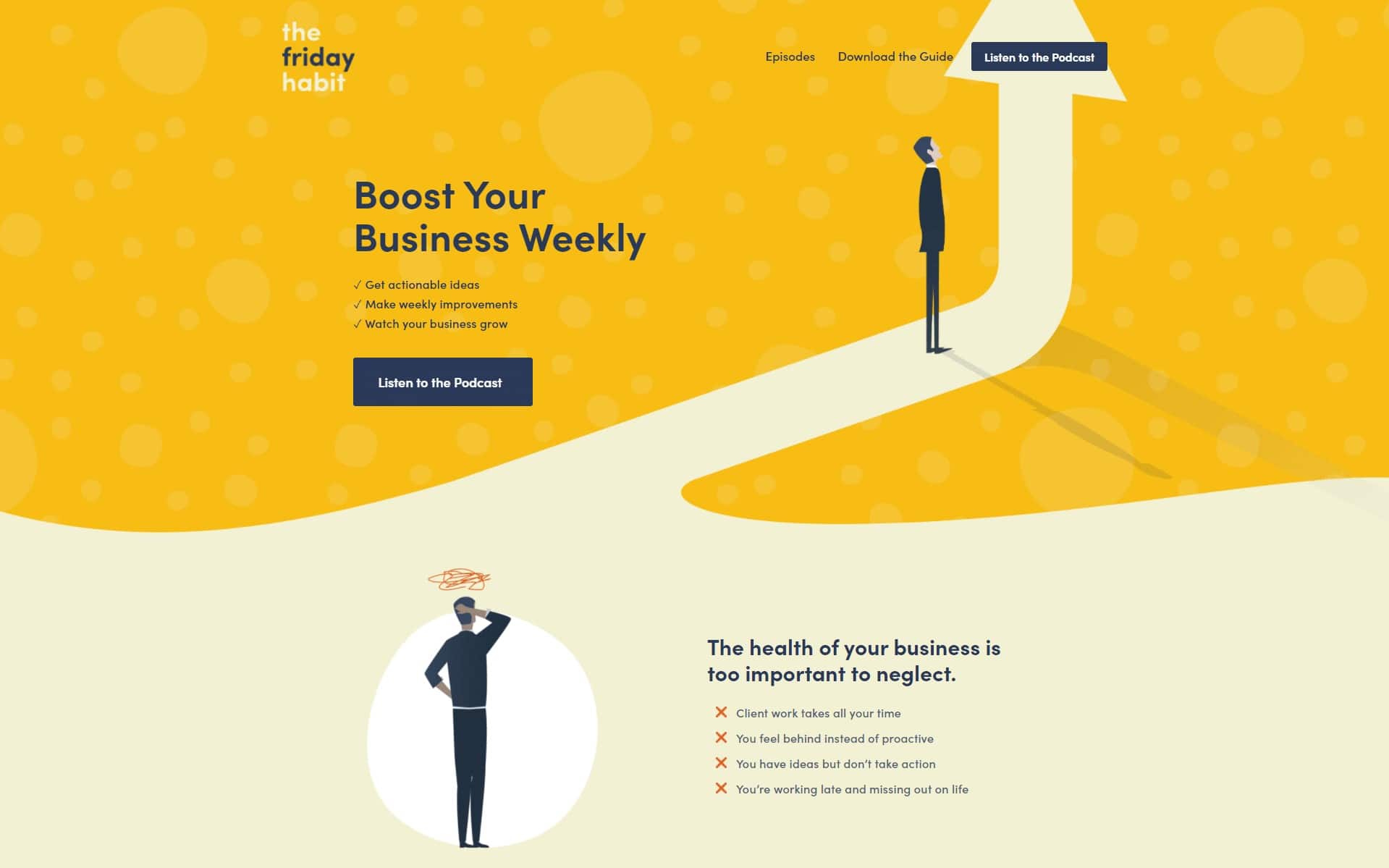
The Friday Habit’s landing page is just vague enough to grab your curiosity, yet compelling enough to keep your eyes focused on the page. As soon as you click on the site, you’ll discover what the podcast is all about – boosting your business. The Friday Habit gets straight to the point in sharing the value behind the content, with bullet-point reasons to listen.
As you scroll down the page, we also get a better sense of how well the author of this podcast understands the audience. The content addresses pain points like “you feel behind instead of proactive”. The bright colors and hand-drawn graphics also make the content feel more accessible, and less “clinically” business-like. There’s even an eBook lead magnet to convince you to subscribe.
5. Desert Island Dishes
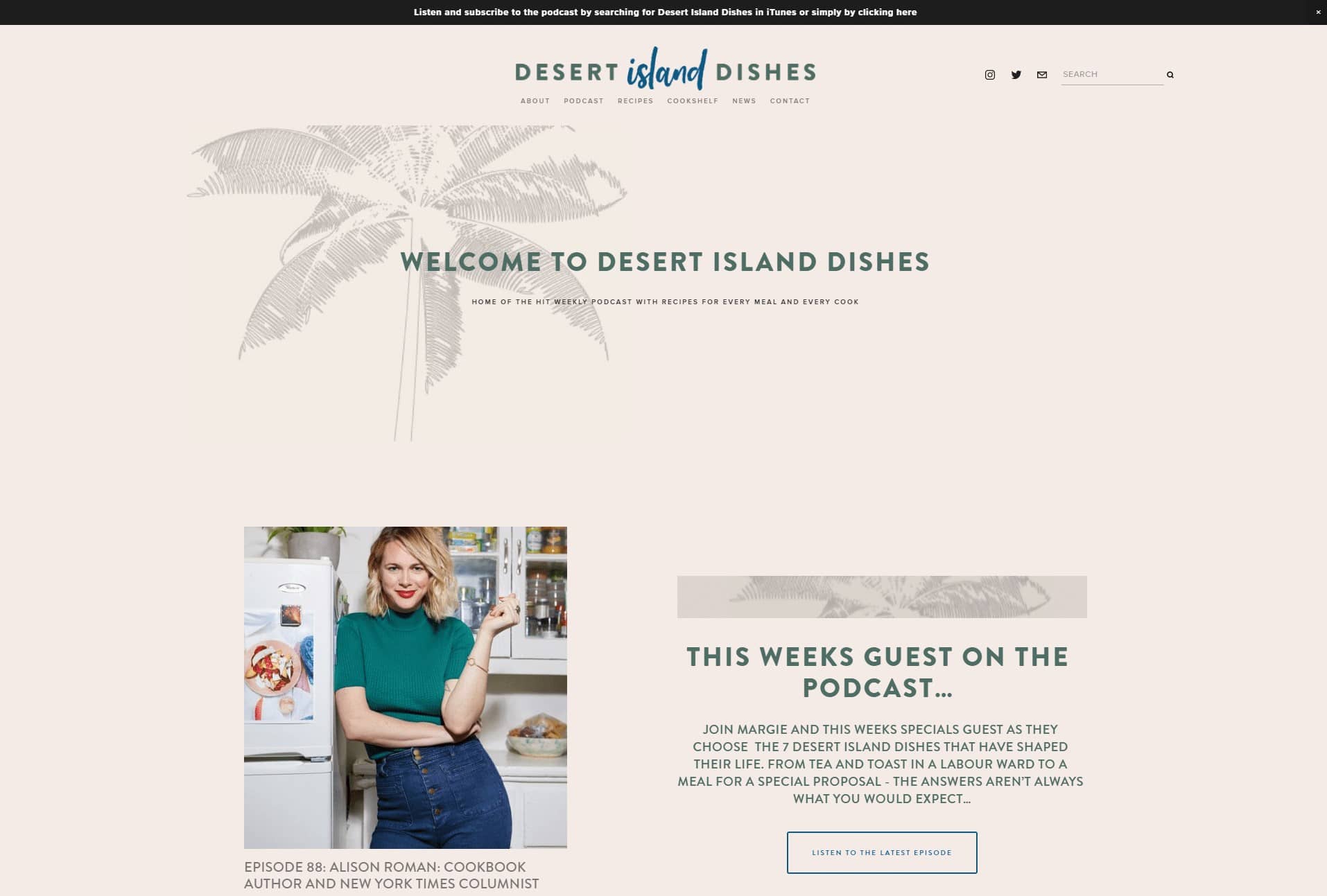
Minimalist, but effective, the Desert Island Dishes podcast landing page has a relaxing color scheme, designed to make you think about sandy beaches and tropical islands. At the top of the page, there’s a pop-up bar allowing you to subscribe and listen to the podcast instantly. You can also scroll slightly down the page to see what the latest episode is about or check out the recipe of the week.
This clean and compelling landing page is easy to navigate and brimming with features to grab your attention. For instance, you only need to scroll for a few seconds to see a list of the latest podcast episodes and get a reminder of when the next one is coming out.
6. 5 Minutes in Church History

Another landing page leveraging a more “minimalistic” approach to design, the 5 Minutes in Church History landing page immediately grabs your attention with a podcast player right there in the page. You can start listening straight away or read the little descriptor snippet for more information about what you can expect to hear about.
As you scroll down, you’ll get an introduction to Dr. Stephen Nichols, the man behind the podcast. Plus, the page offers a range of ways to listen, with buttons leading to Google Play Music, Apple Podcasts, Alexa, and even Google Assistant. You can even listen on Spotify.
7. Unladylike

Unladylike using an eye-catching tongue-in-cheek logo, bright colors and bubbly font to immediately grab your attention on the landing page. Headlines like “Stay Curious, Build Empathy, Raise Hell” are sure to drive the curiosity of any potential listener. What’s more, the design of the landing page makes it easy to sort through episodes, find the blog page, or even subscribe to the newsletter.
This podcast landing page might be simple, but it gets the job done, with easy links to all of your favorite podcast platforms, and plenty of authentic pictures of the women behind the podcast itself.
8. This Week in Startups
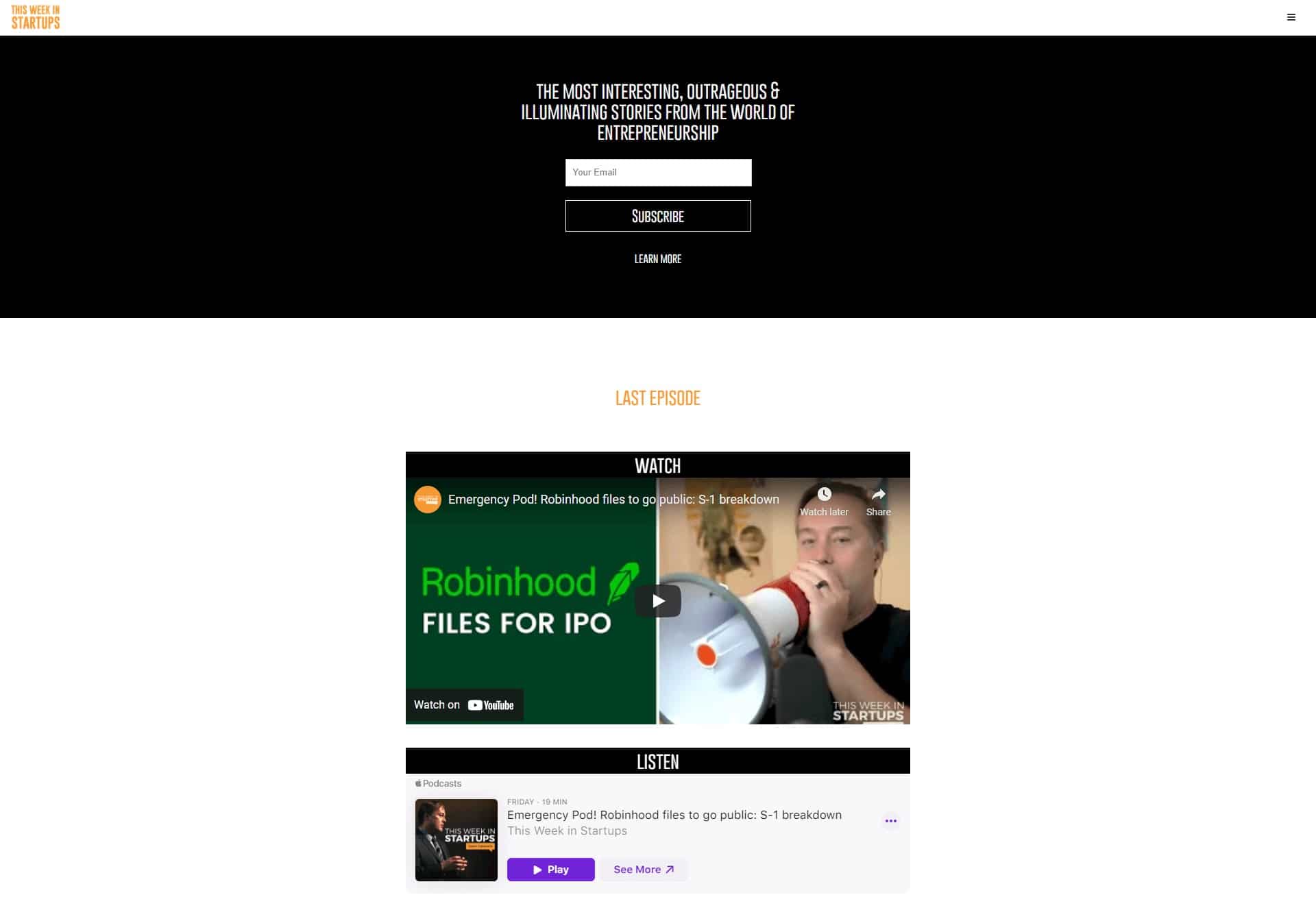
We love how this landing page gets straight to the point, telling you what to expect with a headline promising the most illuminating stories from the entrepreneur world. You can subscribe immediately at the top of the page or scroll down to see the latest episodes. This Week in Startups has a video version of its podcast for YouTube fans too.
The scrolling carousel of recent episodes is excellent for giving you an overview of some of the most interesting recent publications. There’s also a handy “learning” section where you can find news roundtables, launch incubators, science, launch festivals, and more.
9. Jen’s Den

The landing page for Jen’s Den is a beautifully spiritual experience, with luxurious deep purples and invigorating oranges throughout. The page welcomes you in with a quick descriptor of what you can expect from the show, including plenty of dry humor and wit. The tone of voice is an interesting contrast to the otherwise relaxing visual impact of the page.
For those keen to jump straight in, Jen’s Den allows you to start playing the latest episode straight away, from an embedded system on the page. As you scroll down, you’ll find beautiful illustrations, descriptions of the podcast, and even suggestions on what you can listen to between episodes.
10. IDEO Food X Design
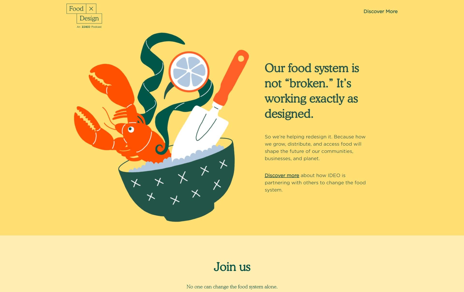
This landing page from IDEO is great for invoking a sense of curiosity. As soon as you land on the page, you get an interesting quote telling you that the food system is not “broken” but working exactly as designed. The page goes on to explain how important it is for today’s innovators to shape the future of the way we distribute and access food.
The bright colors and illustrations on the IDEO page are excellent for making the brand seem more friendly and approachable. We love the community element in the tone of voice too. The option to sign up for the email list says, “No one can change the food system alone”, making you feel as though you’re already part of the community.
11. World War II
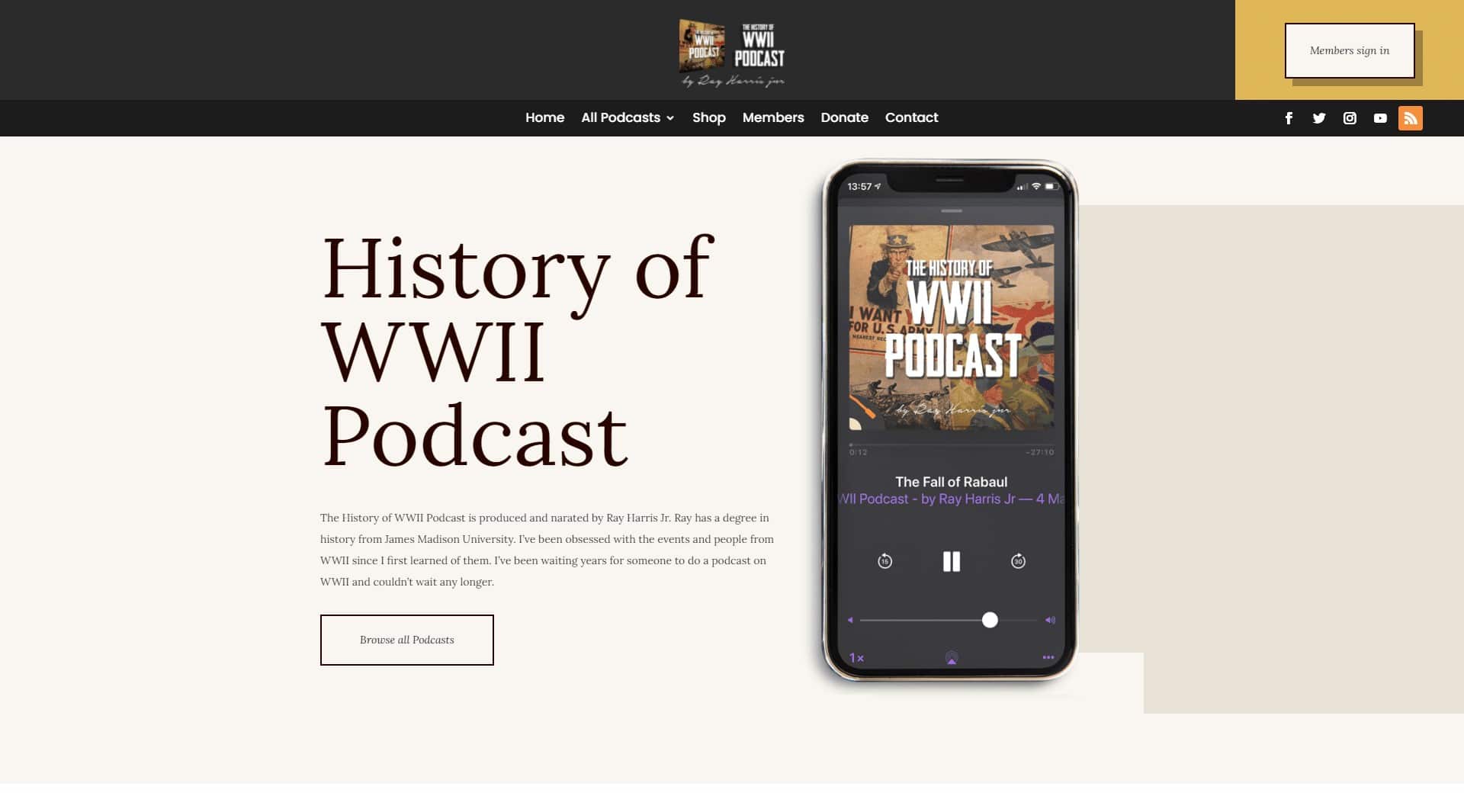
Everything about this podcast landing page says sophistication and credibility, from the clean colors of black, beige, and gold, to the traditional serif font, similar to that on an offline broadsheet. The top of the page entices viewers with a member’s sign in option, advertising that there is a member’s-only experience available.
As you scroll down, you’ll get the option to browse podcasts, or find the episode you want on popular channels like Spotify, PodBean, or Apple Podcasts. This page is simple, but effective, with genuine-looking historical photographs and highly credible wording.
12. Brandee Land

A modern visual appeal and clean layout join forces on the Brandee Land podcast page. The theme is stunning, with bright neon colors on a dark background delivering a cutting-edge aesthetic. The first piece of text you see as you scroll down the page informs you that the podcast is about the weird, mysterious, and magical – which matches the image perfectly.
There’s a mysterious and fun-loving tone to the copy on this page, and it’s wonderful at making anyone and everyone feel welcome. Brandee reaches out to “weirdo’s” geniuses, “time-travelers” and more, making everyone feel like they have a place. You can either subscribe to the email newsletter, listen to a podcast, or check out Brandee’s YouTube channel, all in the same place.
13. The Smarter Sales Show
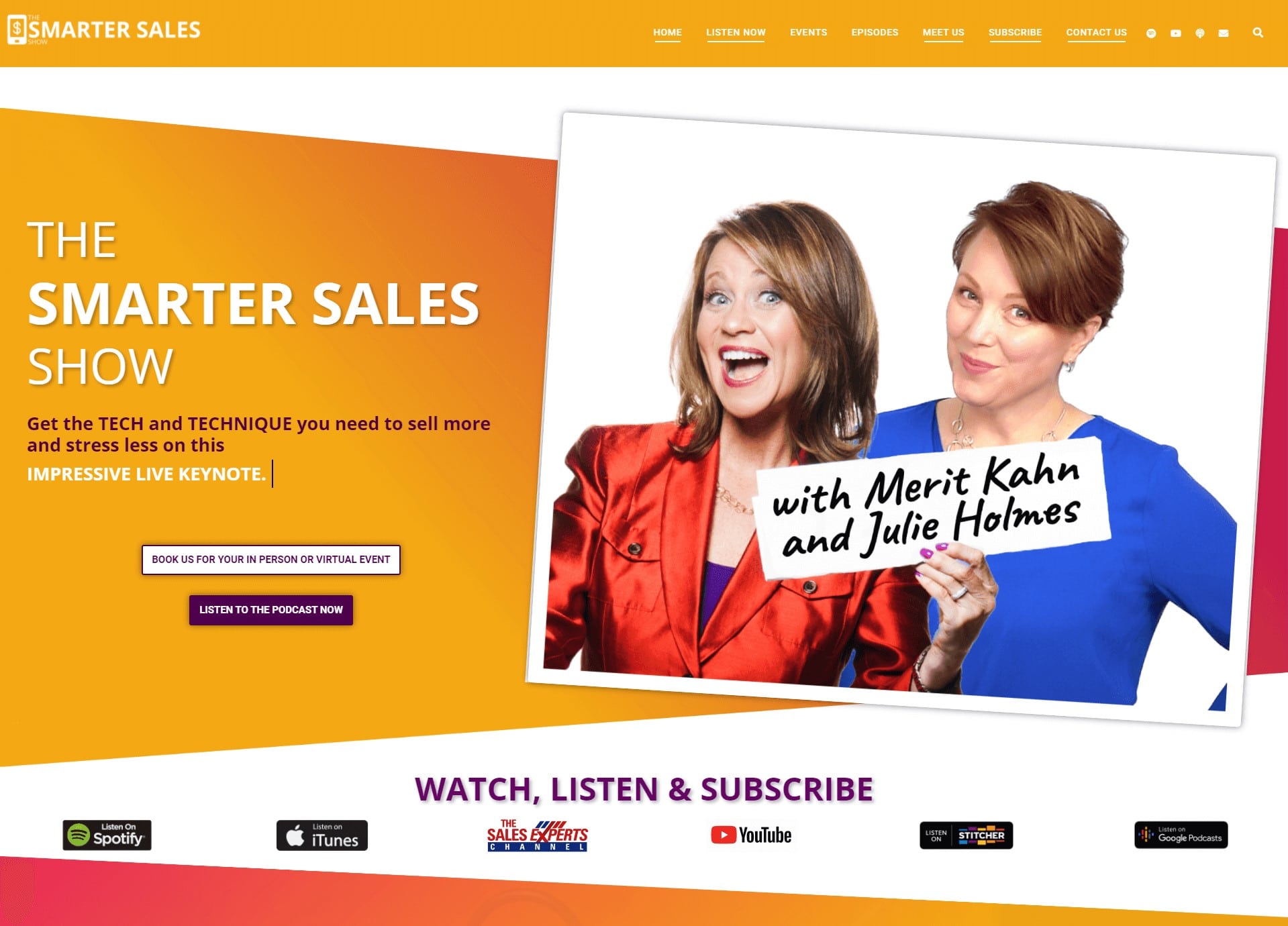
The bright, sunny colors on the Smarter Sales Show landing page are likely to be the first things that grab your attention, followed by the interesting use of text. Podcast creators Julie Holmes and Merit Kahn introduce the podcast by telling viewers they’re going to learn how to sell more straight away. The page also uses a dynamic text bar to describe the show as a “practical virtual program”, a “rave-worthy kick off show” and more.
We love the authentic, fun-loving pictures of Merit and Julie, designed to make you feel like you know the pair straight away. There’s also plenty of ways to listen, watch, and subscribe, from viewing on YouTube, to checking out the podcast on iTunes, which guarantees a wider audience appeal.
14. Food 4 Thot

Everything from the name of this podcast to the quirky collection of images, colors and fonts on the landing page screams fun and enjoyment. Food 4 Thot grabs any viewer’s attention with tongue-in-cheek humor, bold statements, and a bouncy image. At the top of a page, you’ll see a sticky bar letting you know that the podcast is currently on tour.
As you scroll down, you get a list of “guaranteed” experiences you can expect from the podcast, including “diva antics”, and “guest thots who are smarter and hotter than us”. This podcast landing page uses language and imagery perfectly to appeal to just the right audience. The “Meet the Thots” section with links to host profiles is particularly helpful for building an initial audience relationship.
15. Social Media & Politics
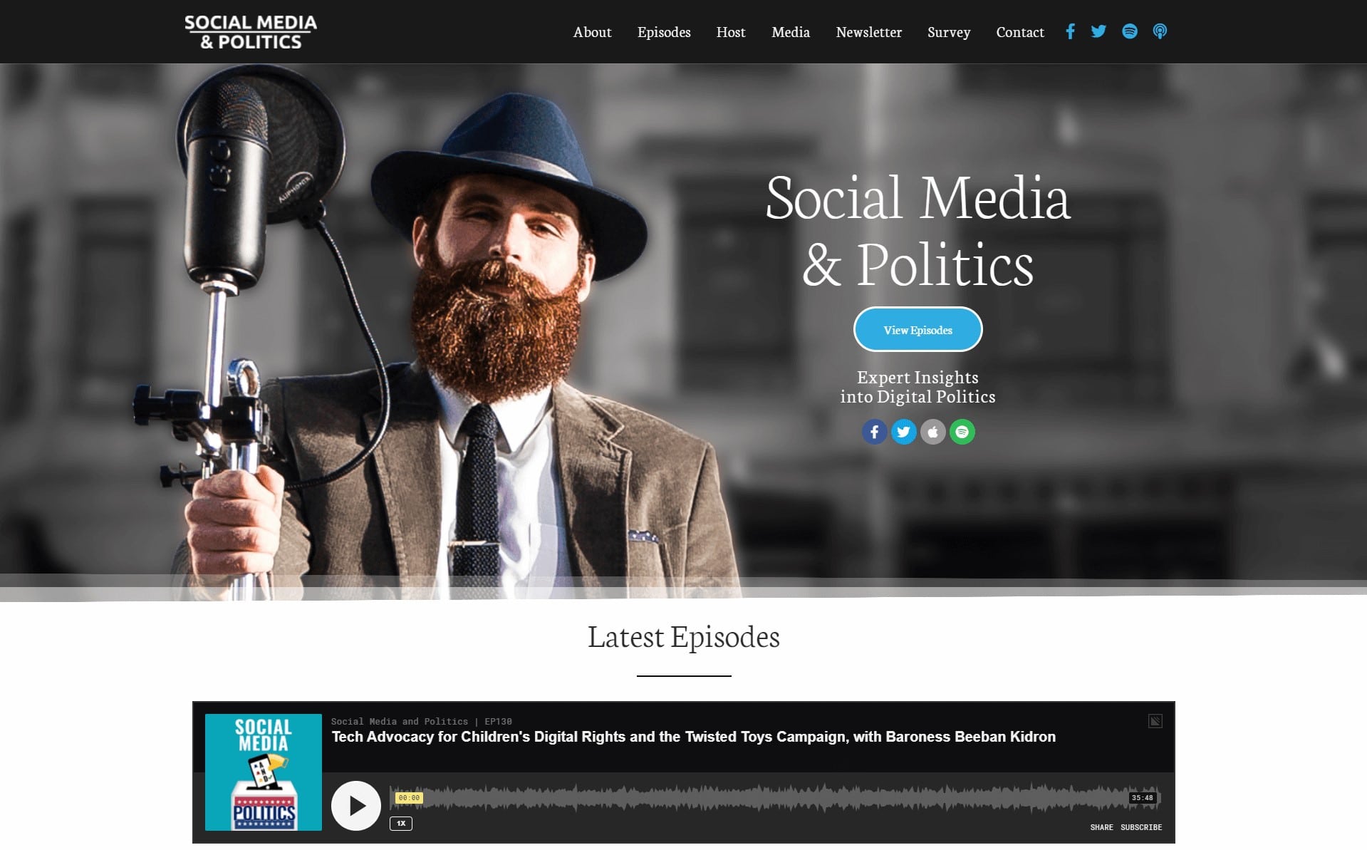
The fantastic background image is the most impressive thing we noticed about this landing page at first glance. Social Media & Politics immediately use an artistic, authentic photo to introduce you to your new listening experience. You also get a series of social media buttons at the top of the page to help you learn more about the host if you want to.
There’s an embedded podcast player in the landing page, so people can start listening immediately. You can also see a list of the latest episodes, with brief but informative descriptions of what you’re going to get out of each session.
16. Script Apart

A professional-looking logo greets potential listeners on the “Script Apart” page. This logo mimics movie title font styles from the 80s and 90s, offering an excellent aesthetic for a movie-focused show. At the top of the page, you’ll see a contact tab, episodes list, and the option to “Donate” to the podcast if you want to support it.
We love how clear and concise this landing page is. The description of the episodes at the top of the page draws you in by promising you an interesting behind-the-scenes look at popular movies. You also get the extra altruistic feeling of knowing that when you donate, you don’t just support the team; you also support a series of amazing charities too.
17. Love Food Podcast
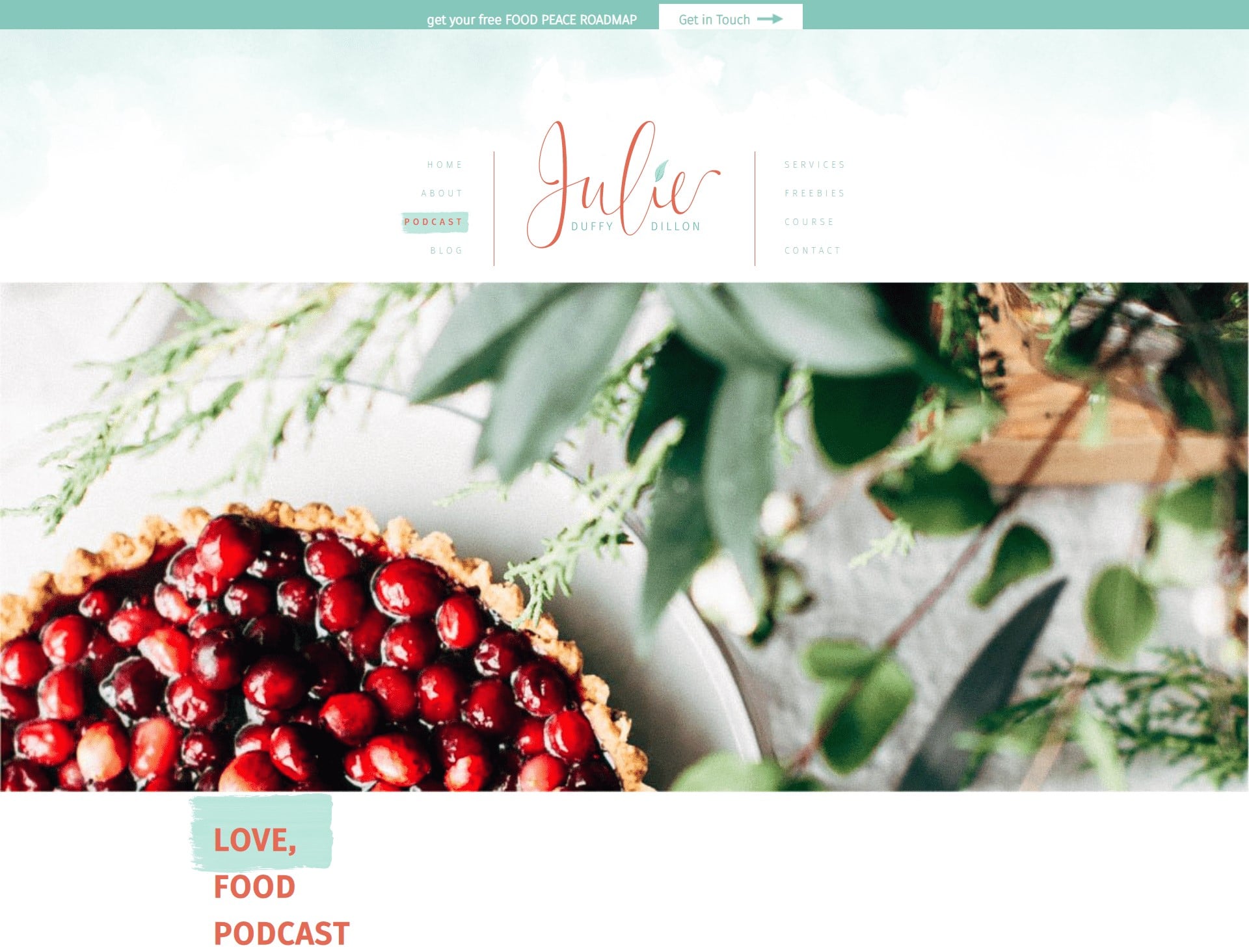
Finally, the Love Food podcast combines soft pastel colors with beautiful mouth-watering imagery to attract any dedicated foodie. At the top of the page, you’ll see the Julie Duffy Dillon logo, followed by a luscious-looking pie to let you know you’re dealing with a food podcast straight out of the gate.
We love the introduction to Julie and her podcast at the top of the page, which demonstrates some of the passion and love that goes into each episode. As you scroll down, you’ll find a search bar to help you track down your favorite episodes, a categories section for browsing, and a list of the latest podcast episodes to choose from.
Create Your Own Podcast Landing Page
Hopefully, this list has given you some crucial inspiration for building your own amazing podcast landing page. Remember, the right page will encourage people to sign up and listen to your podcast. Still, it also gives you a chance to nurture leads in a wide variety of different ways, by allowing you to keep in touch via email and social media.
Get your landing page right, and you could build an amazing community for your podcast.


