An email newsletter is an excellent way for you to keep your business top of mind for subscribers. By sending out well-crafted newsletters regularly, you can build trust with your audience and drive more sales as well.
However, the most engaging newsletter in the world won’t do your business much good if you don’t have an effective means of capturing new email subscribers.
That’s where newsletter landing pages come in into play.
A well-designed email newsletter landing page can skyrocket the rate at which website visitors sign up for your newsletter and allow you to quickly grow your subscriber list as a result. However, to create a highly effective landing page for your newsletter, it can be helpful to get some ideas from companies that have done an excellent job creating these landing pages themselves.
Here you can find 21 excellent newsletter landing page examples for inspiration.
1. Kitchen Garden Foundation
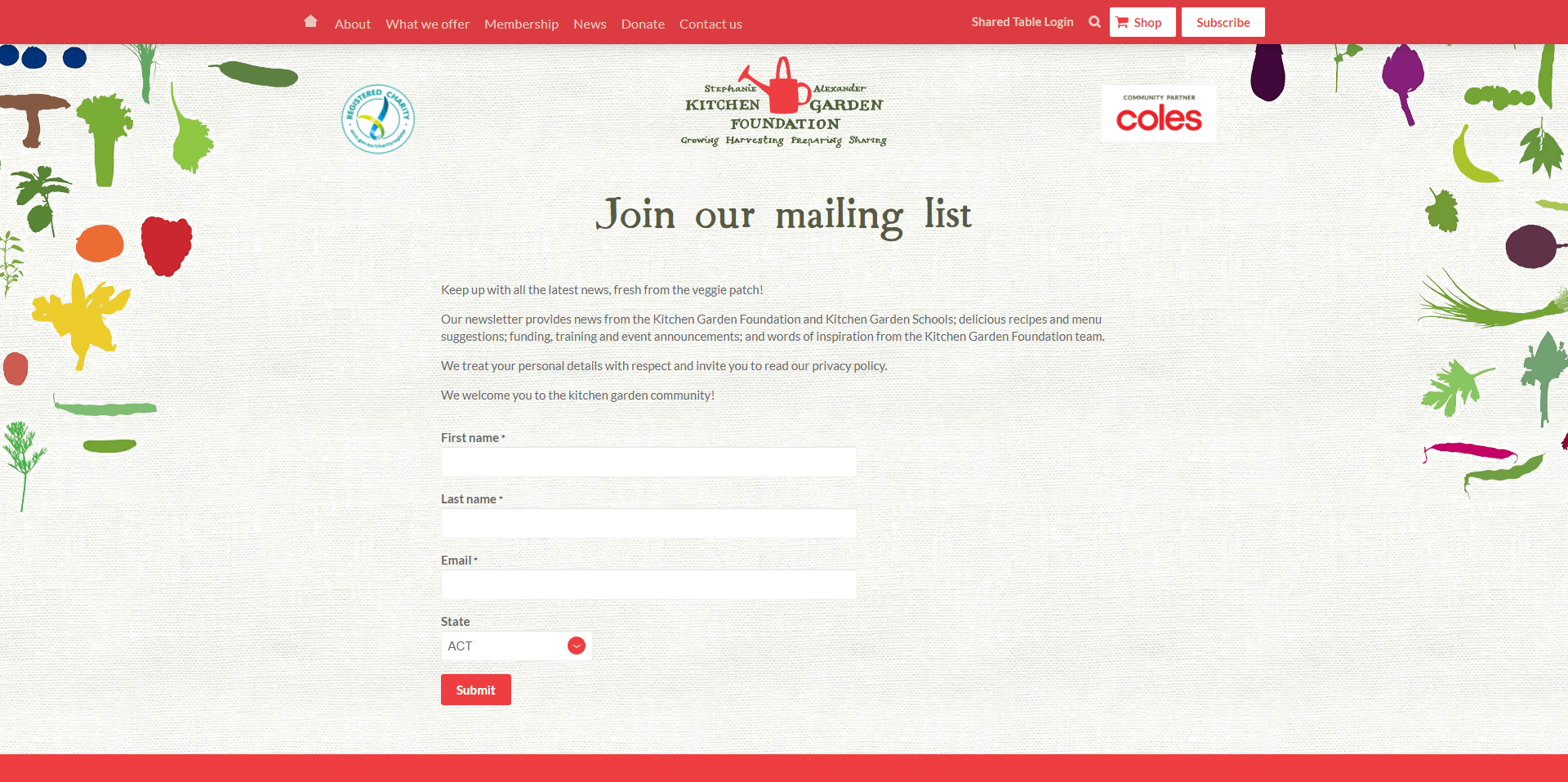
The beautifully textured design of this landing page immediately grabs attention and earns customer interest. Though simple, the Kitchen Garden Foundation’s landing page is aesthetically pleasing and clean, with nothing to confuse or overwhelm the audience. We love the unique combination of colors used here and the fact users don’t have to enter too much information to access the newsletter.
The tone of voice is appealing in this landing page too. Words like “fresh from the veggie patch”, really show you what kind of content you can expect.
2. Digital Marketing Institute
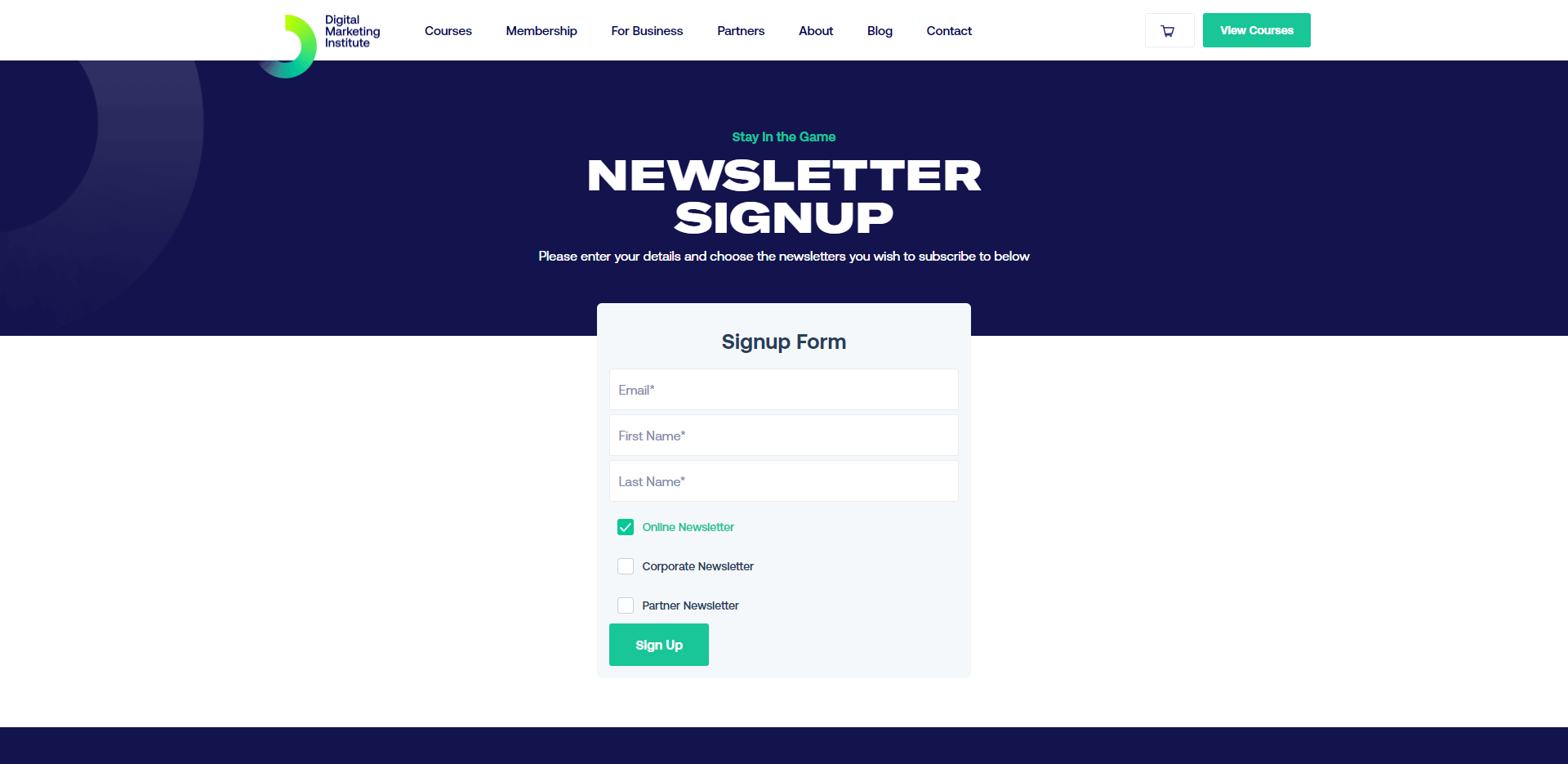
Another example of an attractive landing page with minimal clutter, the Digital Marketing Institute subscription page uses all of the brand’s colors to make a professional impact. The signup button grabs attention in a contrasting color, while the signup form itself only has 3 fields to fill out, making life easier for customers.
Our favorite feature here is the ability to choose which newsletters you want to subscribe to. You can either select the online newsletter, corporate newsletter, or partner newsletter.
3. Engaiodigital

The Engaiodigital landing page takes a different approach to some of the designs mentioned on this list. While you can subscribe immediately at the top of the page by entering your email address, you can also scroll down for insights into why you should sign up.
Engaiodigital provides a list of top reasons why customers should consider joining the email newsletter list. This is an excellent way convert people who might still be on the fence about sending their information to an unknown business.
Related: 15 Kickstarter Prelaunch Landing Page Examples for Inspiration
4. Dricore

Dricore invites customers to join their products “club” rather than just asking them to sign up for a newsletter. The use of the term “club” helps to make the newsletter list feel more like an exclusive group, improving the chances that clients will want to sign up.
Dricore reminds customers they’ll gain access to special offers and promotions for “FREE”, which is a great way to guarantee all clients know exactly what they can expect when they sign up. All you need to do is enter your first and last name to sign up, and adding a phone number is optional.
5. TDP Clothing
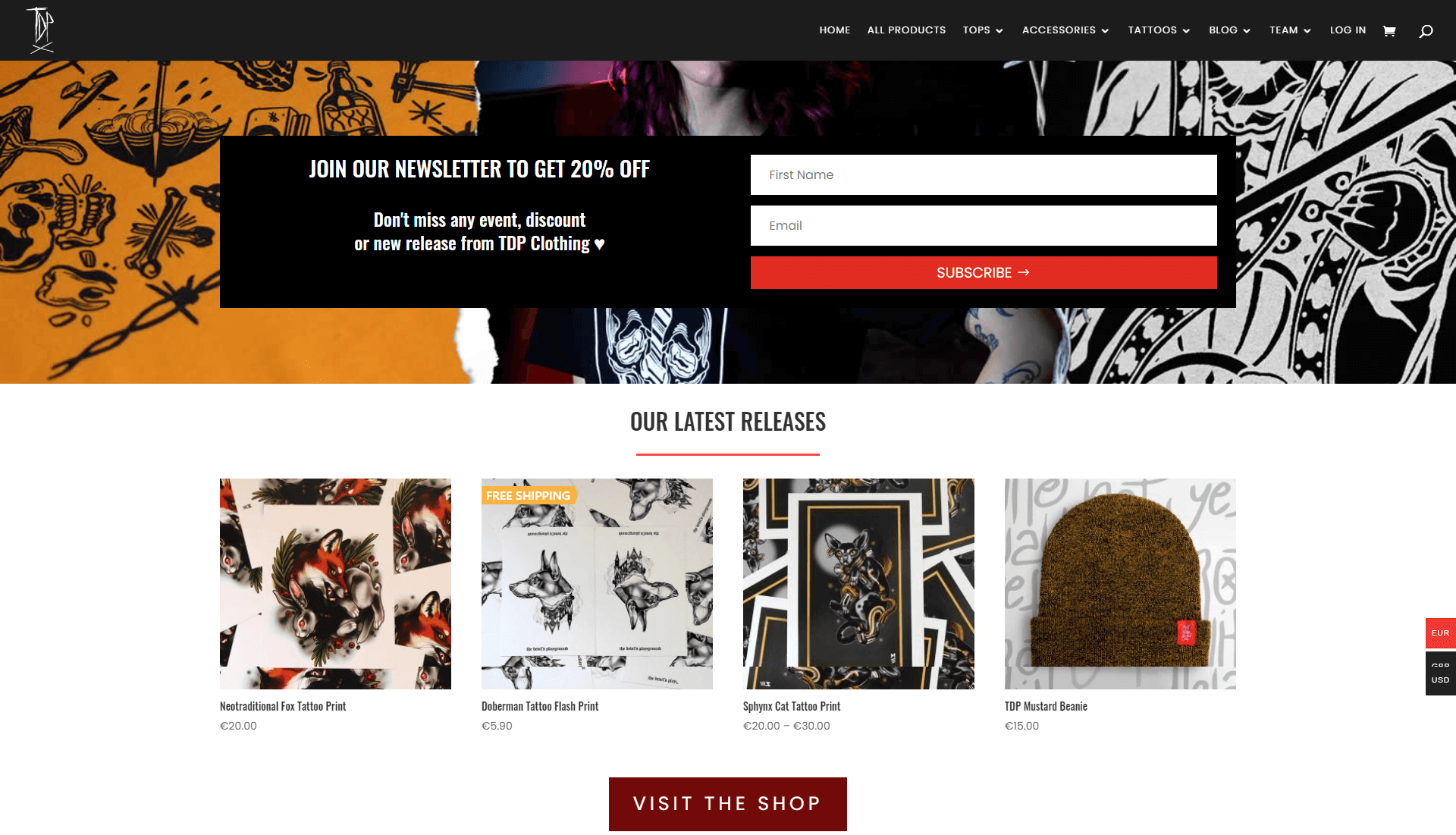
TDP Clothing has clearly built its landing page to demonstrate the unique personality of the brand. You immediately get to see some of the latest releases on the signup page as a reminder of why you should sign up. Additionally, the company adds the bonus of getting a 20% discount when you sign up for the newsletter as an incentive.
Signing up for the newsletter is quick and simple, so you don’t have to worry about having to enter a lot of personal details.
6. Toasting Good
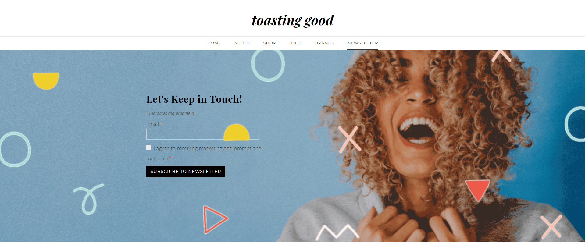
Toasting Good gives customers multiple ways to sign up for its newsletter, starting with a popup as soon as you arrive on the site. If you make it to the newsletter landing page, you’ll see an engaging image in the background designed to grab your attention.
The attractive image with a real human being helps to improve the emotional connection between the brand and its potential subscribers. The clean and simple design of this newsletter landing page is fantastic, and you can even access the page from the website menu.
7. Julian Fashion
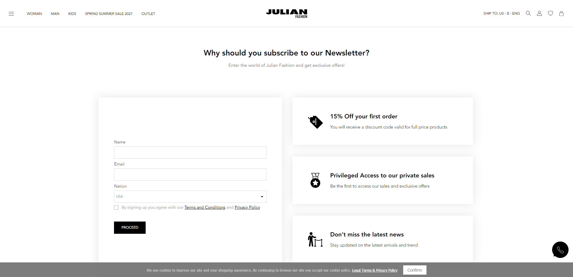
The Julian Fashion company ensures you can instantly see why it’s such a good idea to sign up for the newsletter. As soon as you arrive on the landing page, you see a simple and clean form for subscription, with a series of benefits for signing up listed to the right.
The biggest incentive is the ability to access 15% off your order when you join the email newsletter list. However, you’re also reminded that the newsletter will keep you up to date on the latest news and give you “privileged” access to the latest offers.
Related: 23 Mind-Blowing Email Newsletter Statistics
8. Food for Others
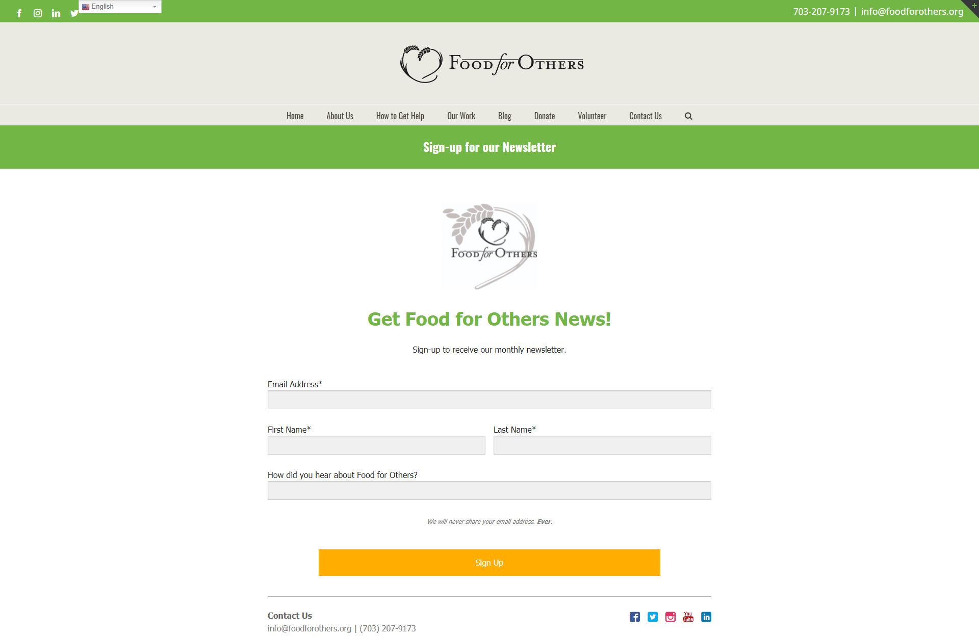
Beautifully designed, the minimalist newsletter landing page from Food for Others matches the rest of the company’s branding perfectly. As you scroll down the page, you’ll also find a bright orange “sign up” CTA to remind you to submit your details.
Our favorite feature is the ability to click on a link to see previously published newsletters. This option means customers can see what they’re likely to end up seeing in their inbox before they decide to subscribe.
9. Women in the Food Industry
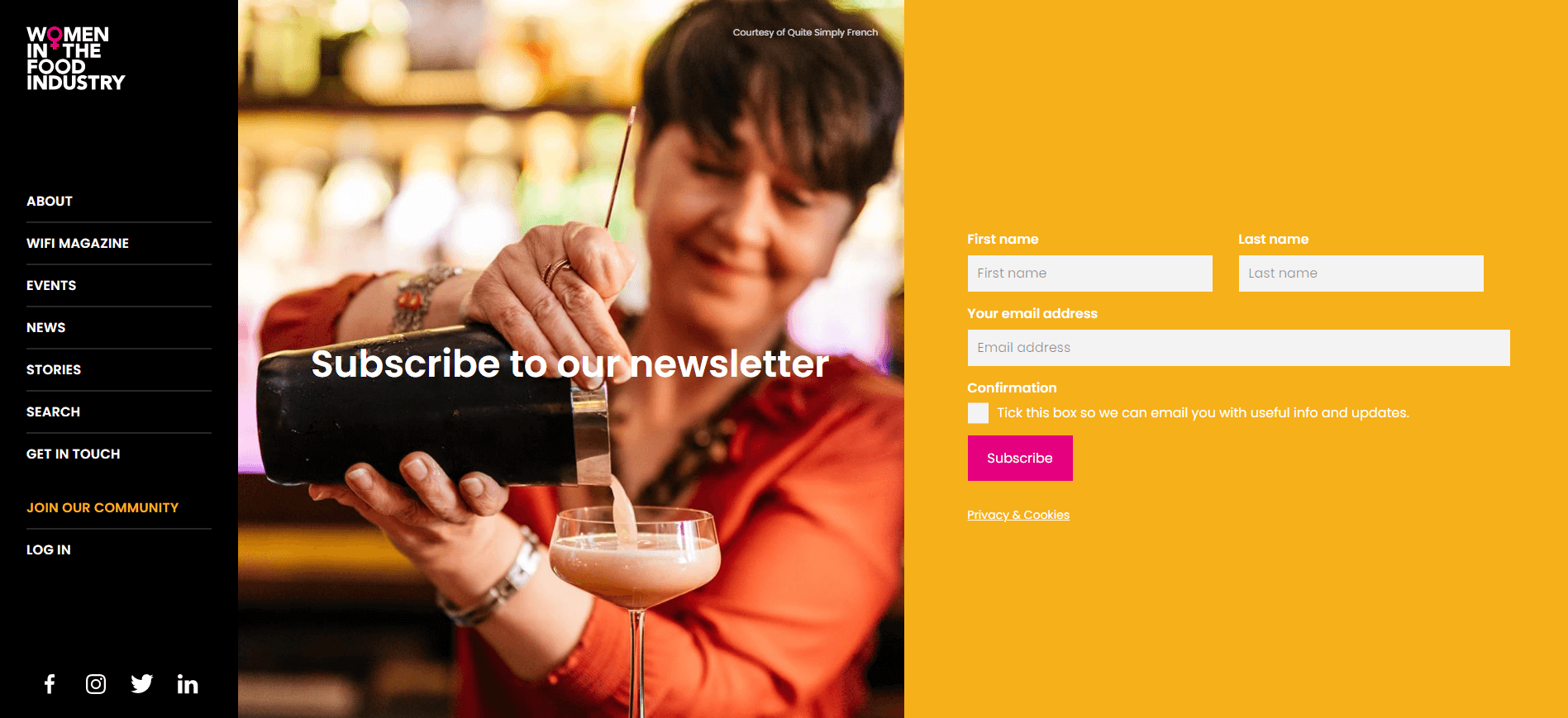
The Women in the Food Industry website has created a beautifully eye-catching landing page for its landing page. There’s plenty of color to immediately grab the attention of any visitor. The supporter’s logos at the bottom of the page also help to build social proof and establish the company as a trustworthy brand.
The use of a real person in the photo background of the landing page here is a nice touch, as it reminds you that you’re joining a genuine community of real people.
10. Vegan
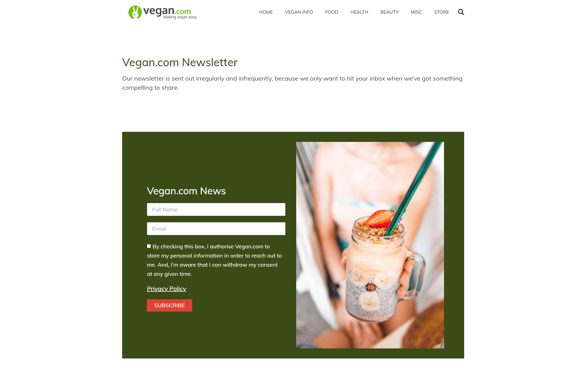
While the clean and minimalist design of this newsletter landing page is beautiful, it’s the copy that really makes the page stand out. At the very top of the page, you’re hit with an honest admission from the company about their newsletter strategy. You learn you’ll only get messages “irregularly” and “infrequently”, because the group wants to ensure it’s sharing value.
This transparent approach gives customers an idea of what they can expect when they join the community, and it offers an insight into the company’s personality.
11. CSIRO
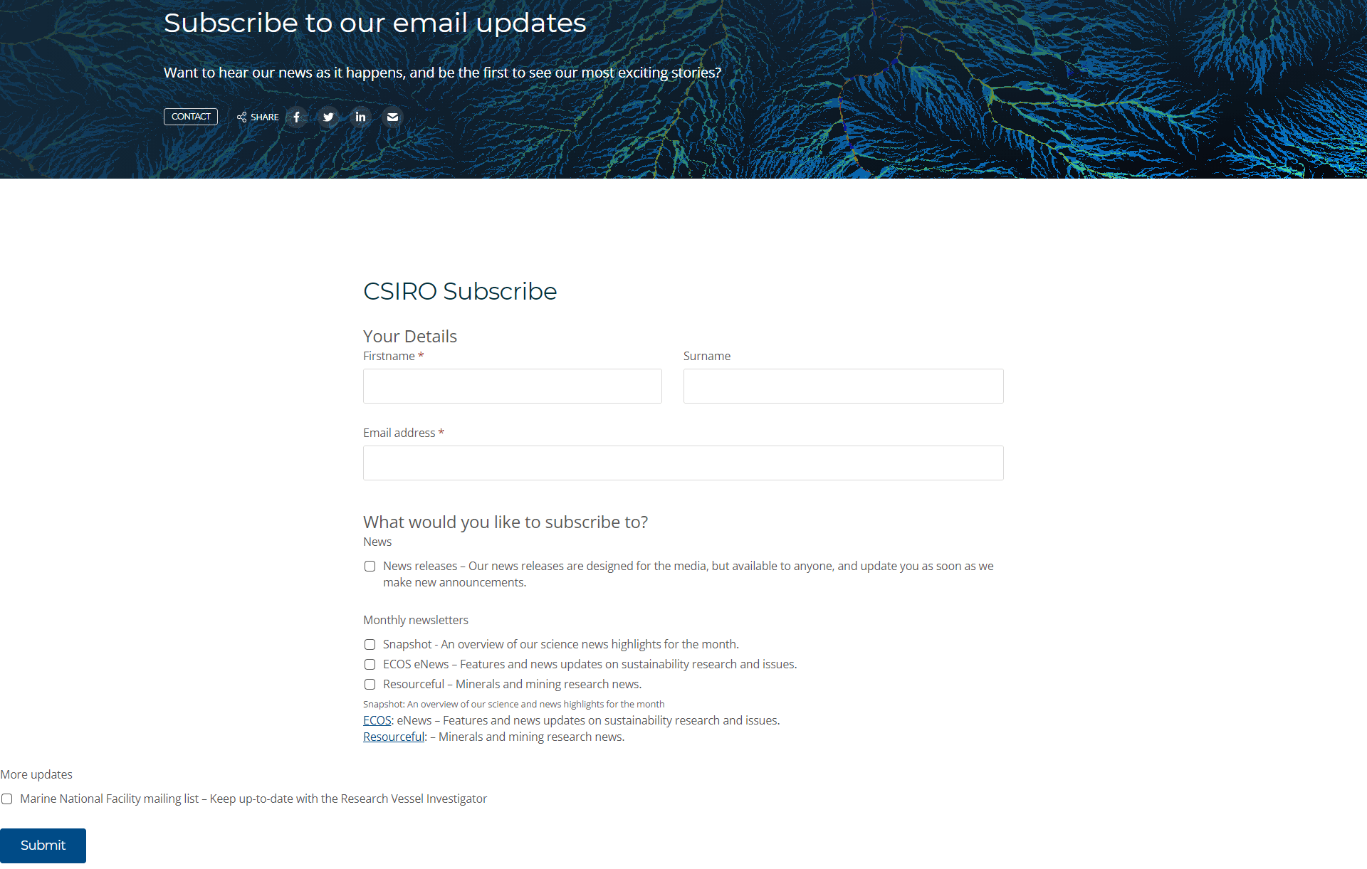
This is an attractive newsletter landing page, with plenty of engaging color and texture to draw the eye. Like many of the top options on this list, the copy is simple and straightforward, so you don’t have to spend ages reading before you signup.
We love the fact that you can choose what kind of email newsletters you want to receive. You can subscribe to scientific snapshots, check out the latest news, or opt to get resourceful updates about minerals and mining research.
12. CoffeeCup
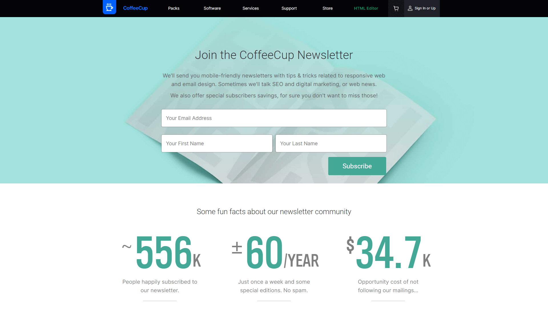
Bright, clean, and easy to read, this email newsletter landing page tells users exactly what to expect when they subscribe. The page is easy to navigate and doesn’t ask for a lot of personal information. You also get a selection of “fun facts” about the newsletter community, which is great for getting an insight into what you can expect, like “just once a week”.
Showing potential subscribers there are already more than 550k people in the newsletter is also an excellent way to demonstrate the messaging as being worthwhile.
13. Planetary Health Alliance
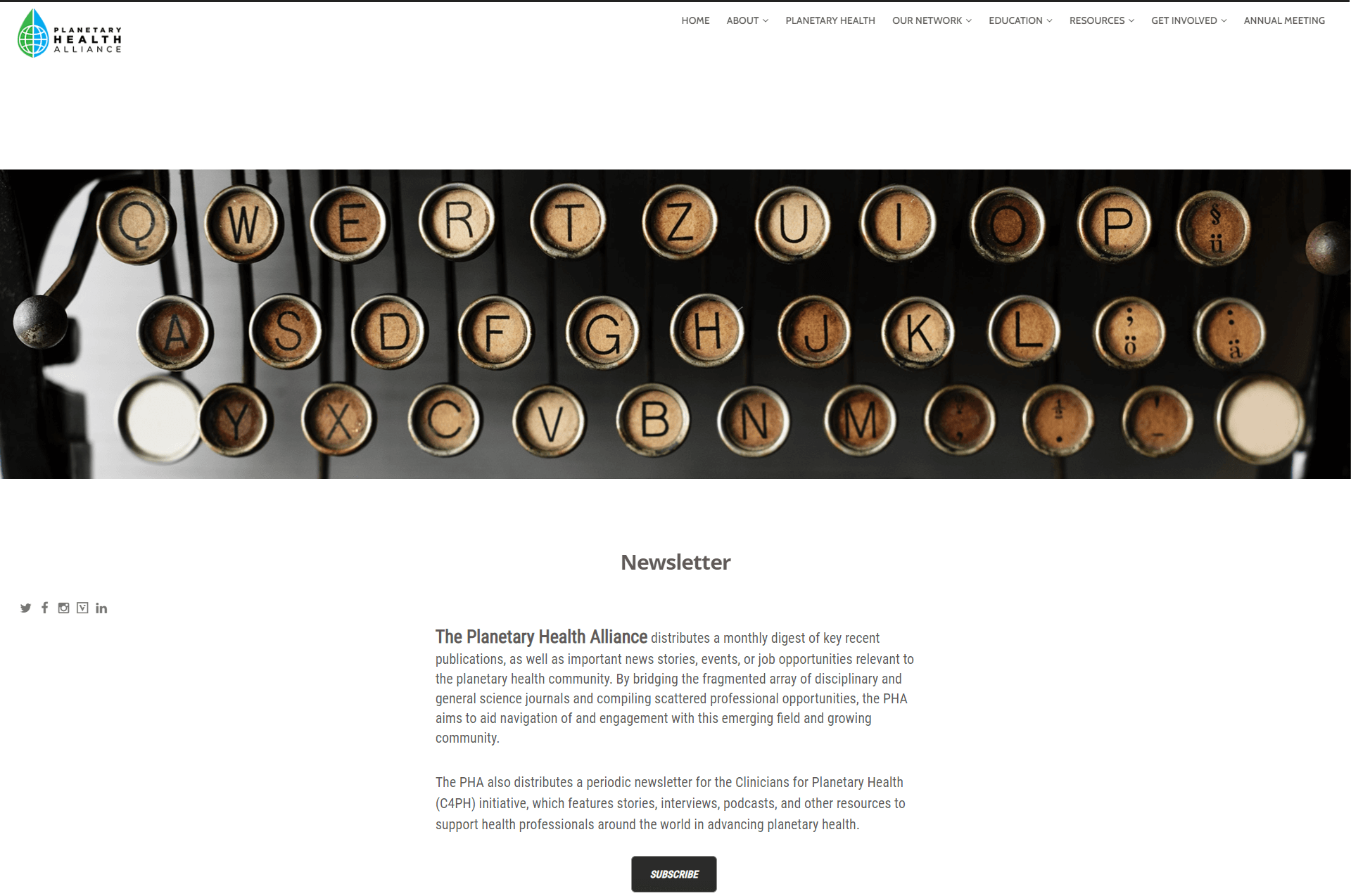
We love the scrolling design in this email newsletter landing page, which makes the content feel more dynamic and eye-catching. At the top of the page, you get an insight into what you can expect from the newsletter, which is great for anyone who might be unsure about signing up. There’s also a range of previous newsletters listed below the subscribe button.
Being able to click on the various newsletters from the previous months means you can determine what kind of information you’re going to get in your inbox. It’s a wonderfully transparent way to gain subscribers.
14. Biff1

The Biff1 website for the Boulder International Film Festival uses its landing page to tell people why they should consider signing up for the newsletter. The main focus of this page is letting customers know how they can stay informed about upcoming events, films, and important announcements.
To make signing up as pain-free as possible, the site only asks for an email address to get you started. Additionally, you have the added benefit of being promised “special insider offers and tips” when you decide to subscribe. The reminder you can unsubscribe at any time is a nice touch.
15. Our Mental Health Minute

At first glance, this newsletter landing page seems quite plain, but its minimalist approach is surprisingly effective. There aren’t any overly obvious bells and whistles attached to this page to try and convince you to sing up. Instead, you get all the information you need – such as where you can get in touch with the company.
Before you sign up, Our Mental Health Minute reminds you it will take your privacy seriously, so you can rest assured your details won’t be passed onto any other companies.
16. My Anthem Health
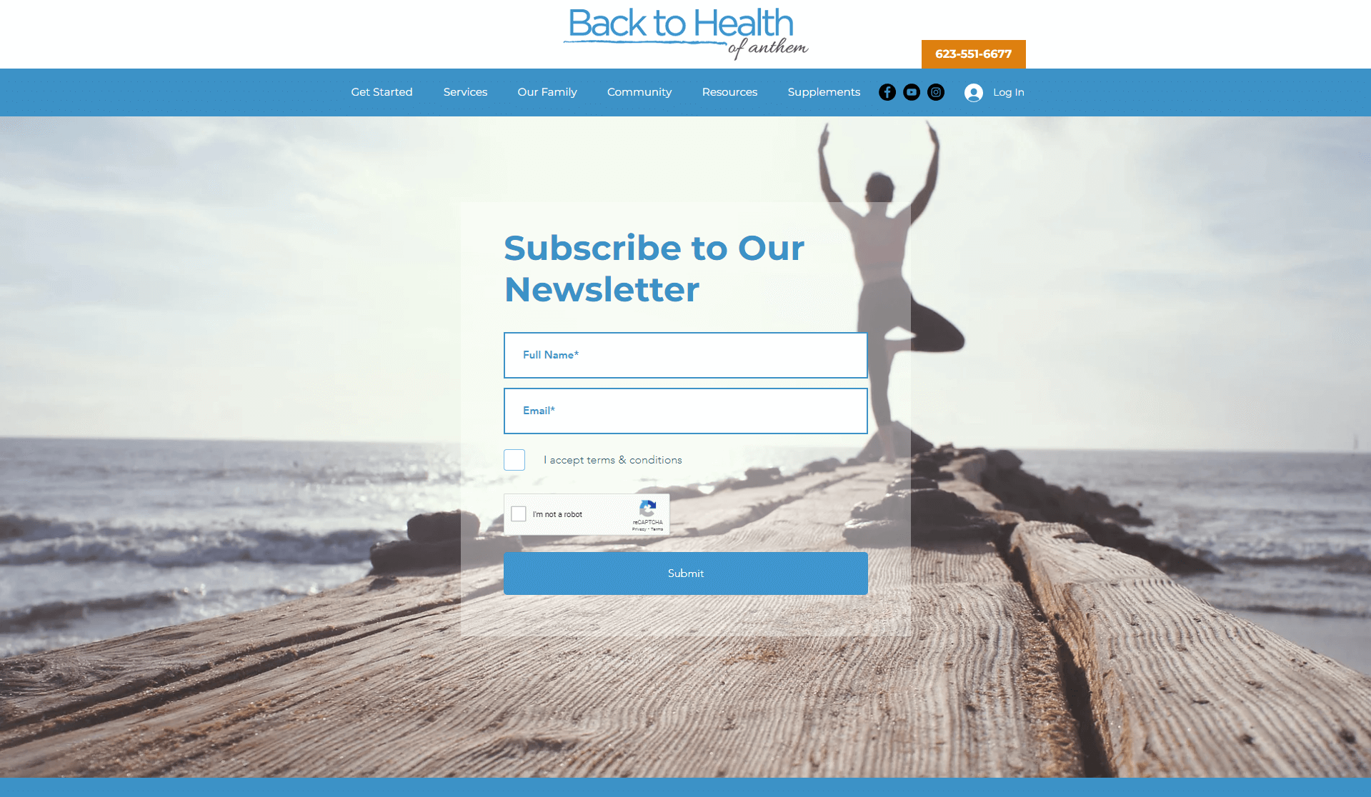
Simple but effective, this newsletter landing page from My Anthem Health uses a beautiful background image to give you an insight into the kind of life you can lead with the company’s help. The site is all about improving your health and wellness, and the image does well to showcase that.
Like many of the top newsletter subscription pages, this option requests very little information from customers – just a full name and an email address. The Captcha won’t take up too much time either, as you only need to click a box.
17. Holistic Health Code
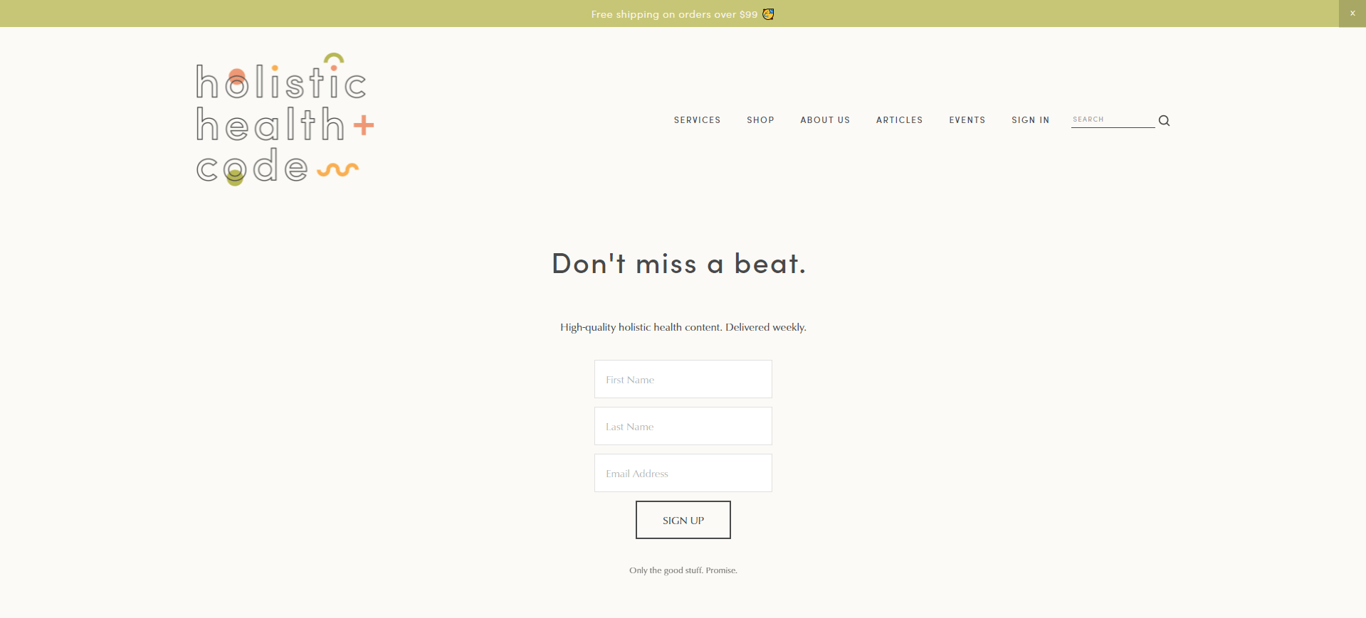
Another insight into why minimalist landing pages can often be the best, Holistic Health Code’s page is beautifully clean and simple. The site gives you multiple ways to sign up for the newsletter, including a pop-up promising 10% of supplements when you get involved.
The landing page lets you know exactly what you can expect from the company – namely, high-quality content about holistic health. The statement at the end of the form “Only the good stuff. Promise”, is a great insight into the personality of the company.
18. Publisher Weekly

Publisher Weekly takes a unique approach to its newsletter subscription landing page. Initially, the top of the page tells you exactly what you can expect from the company and when. However, under the box where you add your email address, you’ll also find a ton of social proof. There are logos from other subscribing companies, and twitter posts from leading influencers.
Scroll further down the page and you can check out information from the latest issues, so you’re not missing out on any previous content which might be relevant to you.
19. Insight Factset
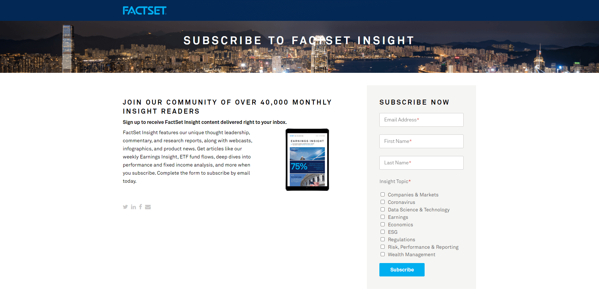
Perfectly aligned with the rest of the company’s brand image, the Insight Factset newsletter landing page is sleek, professional, and straightforward. You get an immediate insight into the kind of information you’re going to receive from the newsletter. Plus, the company lets you know you’re joining a thriving community of more than 40,000 people.
When you do enter your details to sign up for the newsletter, you’ll be given the option to choose from a range of insight topic options, from economics and earnings to wealth management, regulations, and many others.
20. Vital Smarts

This clean and effective landing page gives you all the information you need to sign up for the Vital Smarts newsletter. You’re immediately reminded that the newsletter is free, and that it’s an award-winning publication. There’s also a reminder you’ll be hearing from award winning authors and joining hundreds of thousands of other readers.
A nice extra touch is the ability to ask the company to contact you when you sign up for the newsletter, if you want to discuss training for your company. This is a great way for the company to build qualified sales leads.
21. Overthink Group
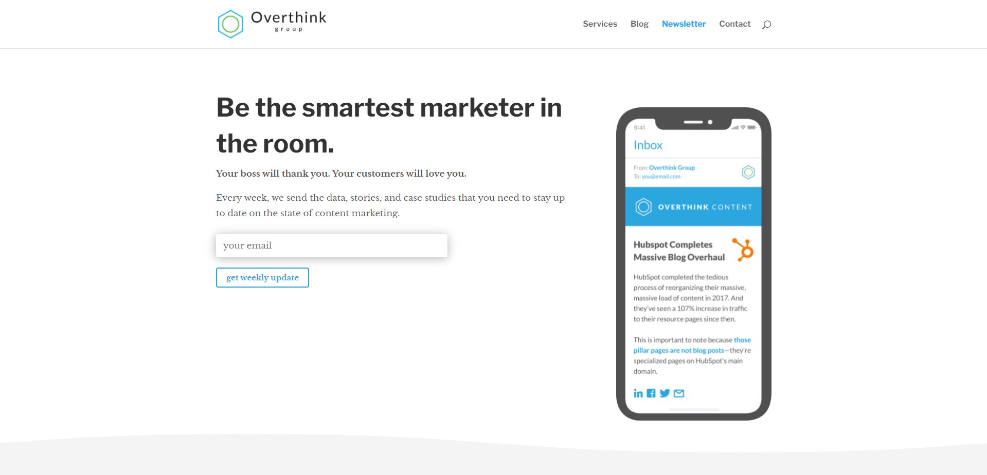
Modern and engaging, this landing page from the Overthink Group immediately lets you know how you can benefit from the newsletter with statements like “your boss will thank you”. All you need to do is enter your email to “get a weekly update” from the company. As you scroll down, you get a fantastic mobile-optimized insight into what the standard newsletter might look like, complete with quotes from leading marketing companies.
The bottom of the landing page also provides additional information on the newsletter and what it might include.
Building the Best Email Newsletter Landing Page
Email is still the best way to connect with and nurture prospective customers. Given that your landing page is the first impression you will make with prospects, it’s important to make sure it’s well designed.
Have some newsletter landing page design tips? Let us know in the comments!


