Creating awareness for your product before you officially launch on Kickstarter is critical for the success of your new business. Effective marketing equates to crowdfunding success.
Fortunately, with a compelling landing page, creating serious hype for your product shouldn’t be too much of a challenge. With a strong Kickstarter landing page, you can build anticipation for the launch date of your product and even capture email addresses so that you can notify your target audience of the big day.
However, in order to make sure that you are building an effective landing page for your business, it can be helpful to refer to a few pre-launch landing page examples.
In this post, you can discover 15 highly effective Kickstarter landing page examples for inspiration.
1. RecPak

RecPak is a brand offering nutritionally balanced meal replacements for hardcore athletes. The company specializes in delivering portable food solutions for people on the move.
As soon as you arrive on the RecPak landing page, you’re hit immediately with a CTA and an amazing offer, “sign up for huge pre-launch discounts.” Immediately, you get a sense of what the company can do, with the stunning backdrop of a mountain to get you visualizing outdoor adventures. The heading “fuel your outdoor adventures” tells you everything you need to know about the product.
If you’re keen to find out more (like most athletes would be), there are drop-down sections where you can check out the benefits and features of the meal substitute, including calorie count. We’re particularly impressed by the countdown timer, which shows you exactly when the Kickstarter campaign will be launching.
2. Tempest Chess Clock
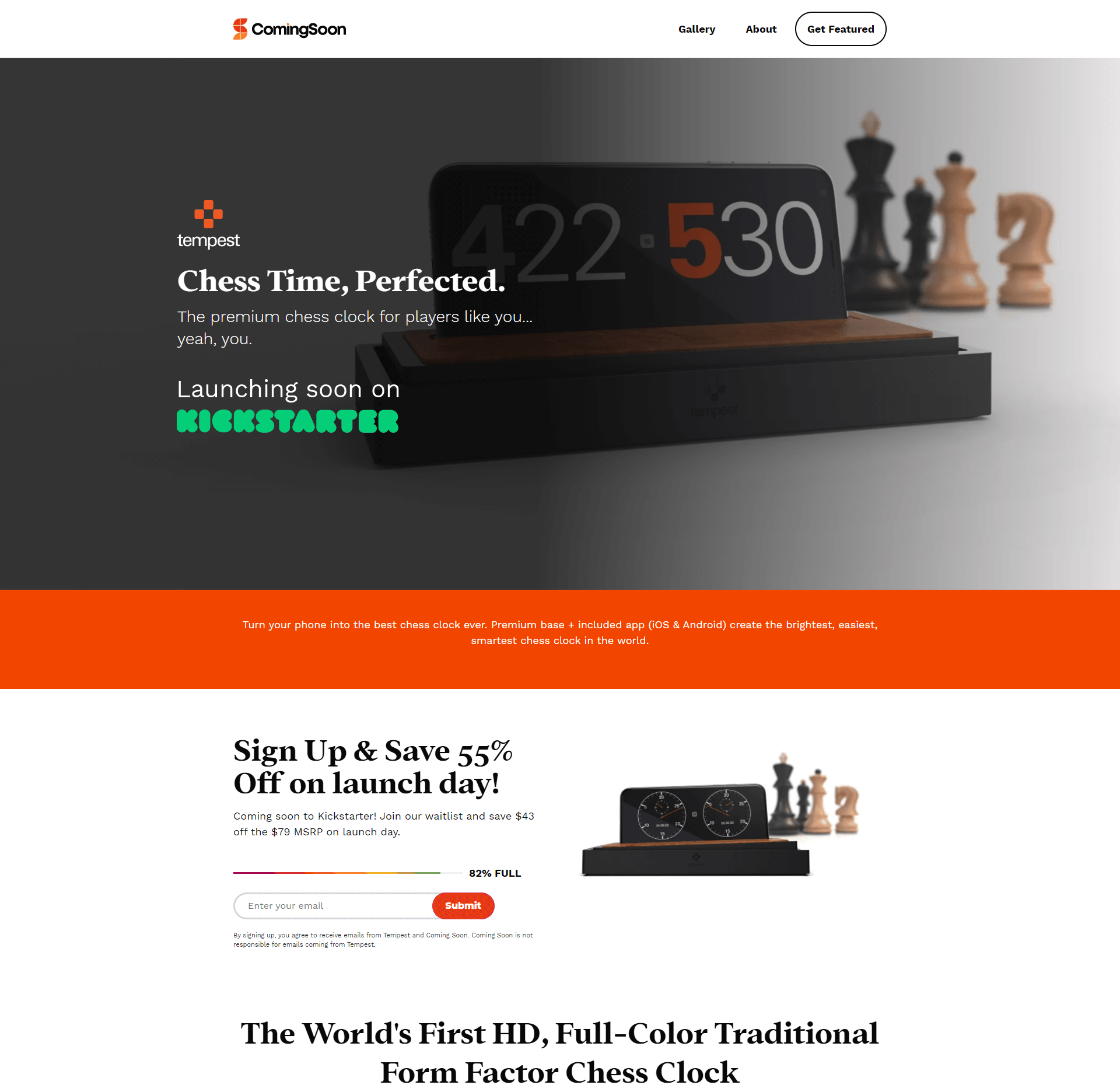
Tempest is a company building innovative solutions for the modern world of chess. The Tempest Chess clock is an intelligent app to help you make the most out of your games. The app requires no Wi-Fi or Bluetooth to use, making it ideal for any kind of game enthusiast.
The stylish image of the clock app working in the background draws attention instantly for this landing page. We also love the header, which is just vague enough to make you want to learn more: “Chess time, perfected.” The language in the landing page talks directly to “you,” creating a sense of affinity. Plus, you get the added bonus of a promised 55% saving if you sign up now.
Our favorite features from this landing page are the 82% full waiting list graphic, which generates a sense of energy. The video quality is great for providing extra information, and we love the FAQ section, where all your questions are pre-answered.
3. Sinex Floating Stand
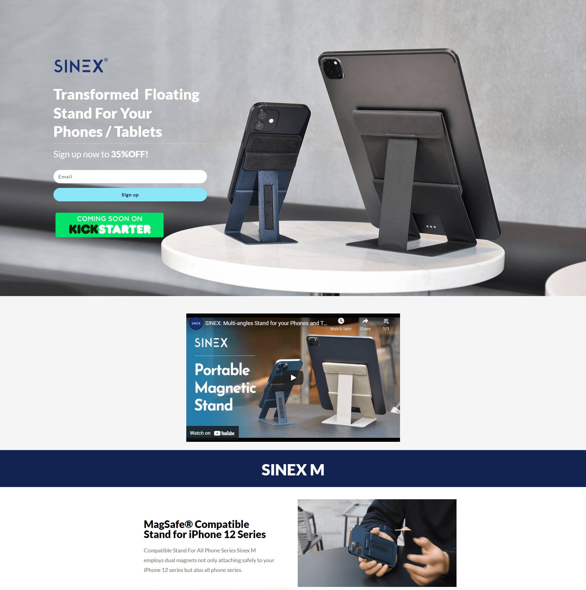
Sinex is a company selling simple and practical accessories for today’s smart devices. The current product on offer is a MagSafe compatible stand for your smartphones and tablets. Unlike other stands, the floating stand is sleek, portable, and available to adapt to a range of angles.
Sinex has created a wonderfully dynamic landing page, with a series of Gif images to show you exactly how the product works, its size, and more. The short clips are far more engaging than a small snippet of text. You also get the immediate benefit of 35% off if you’re willing to sign up first.
The whole page is wonderfully eye-catching, with all kinds of visual elements designed to help you envision the product working with your phone or tablet.
Related: Podcast landing page examples
4. Segmento Watches
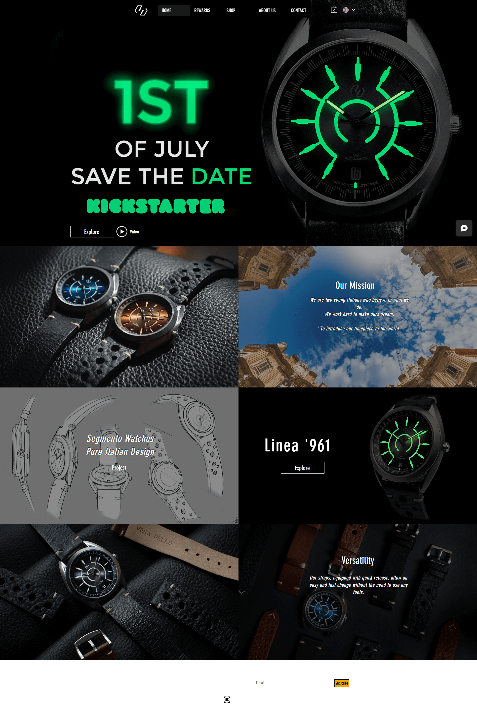
Segmento watches is a company dedicated to creating beautiful watches with Italian design elements. The versatile and attractive watches also come with quick-release straps, so you can change your look instantly when you want to shake things up.
The first thing to grab your attention when you arrive on this landing page is a pop-up offer. While pop-ups can be annoying in some instances, this one does a great job at generating excitement. All you need to do is enter your email, and you can earn a 40% off voucher immediately.
Just like any design-focused company should, Segmento Watches fills its landing page with visuals to show you what kind of quality you can get from the brand. We also love the “save the date” call to action at the top of the page.
5. Wee Stand
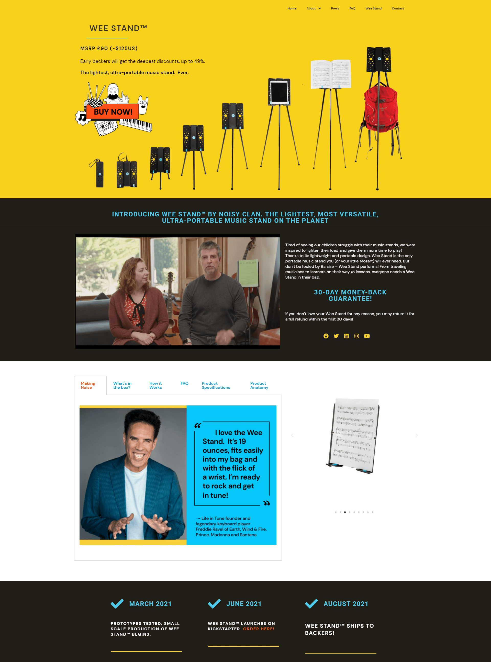
The Wee Stand brand sells portable but powerful stands capable of holding everything from backpacks to music sheets and digital devices.
There’s an instant pop-up to encourage you to sign up to the Wee Stand newsletter, complete with an adorable, illustrated graphic to grab attention. A countdown clock generates an immediate sense of urgency, while the bright colors and fun sketches help to highlight the unique brand personality.
This landing page is also particularly compelling because it’s so interactive. You can click on tabs like “what’s in the box”, to learn more about what you’re going to get for your money. Deals like a 30-day money-back guarantee also offer peace of mind.
6. Effekt Footwear
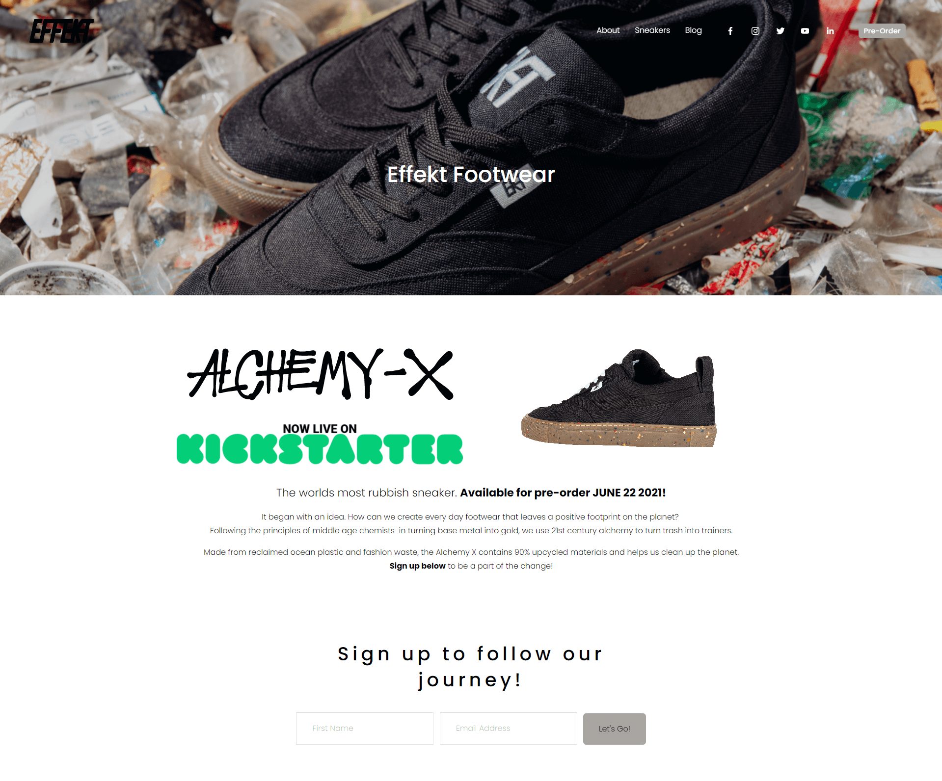
Innovators in eye-catching and sustainable footwear, Effekt footwear aims to reduce our footprint on the planet with eco-friendly shoes. The sneakers, defined by the brand as “the world’s most rubbish” product, transform trash into eye-catching apparel.
Effekt’s landing page instantly grabs attention with a revolving GIF showing the sneaker from every angle. There’s also a handy blurb to tell you more about the company and what it stands for. We love the language in this section, as it’s great for capturing a younger audience.
Effekt’s landing page is simplistic, but appealing, with a simple sign-up form that doesn’t ask for any more information than required.
7. Inkk
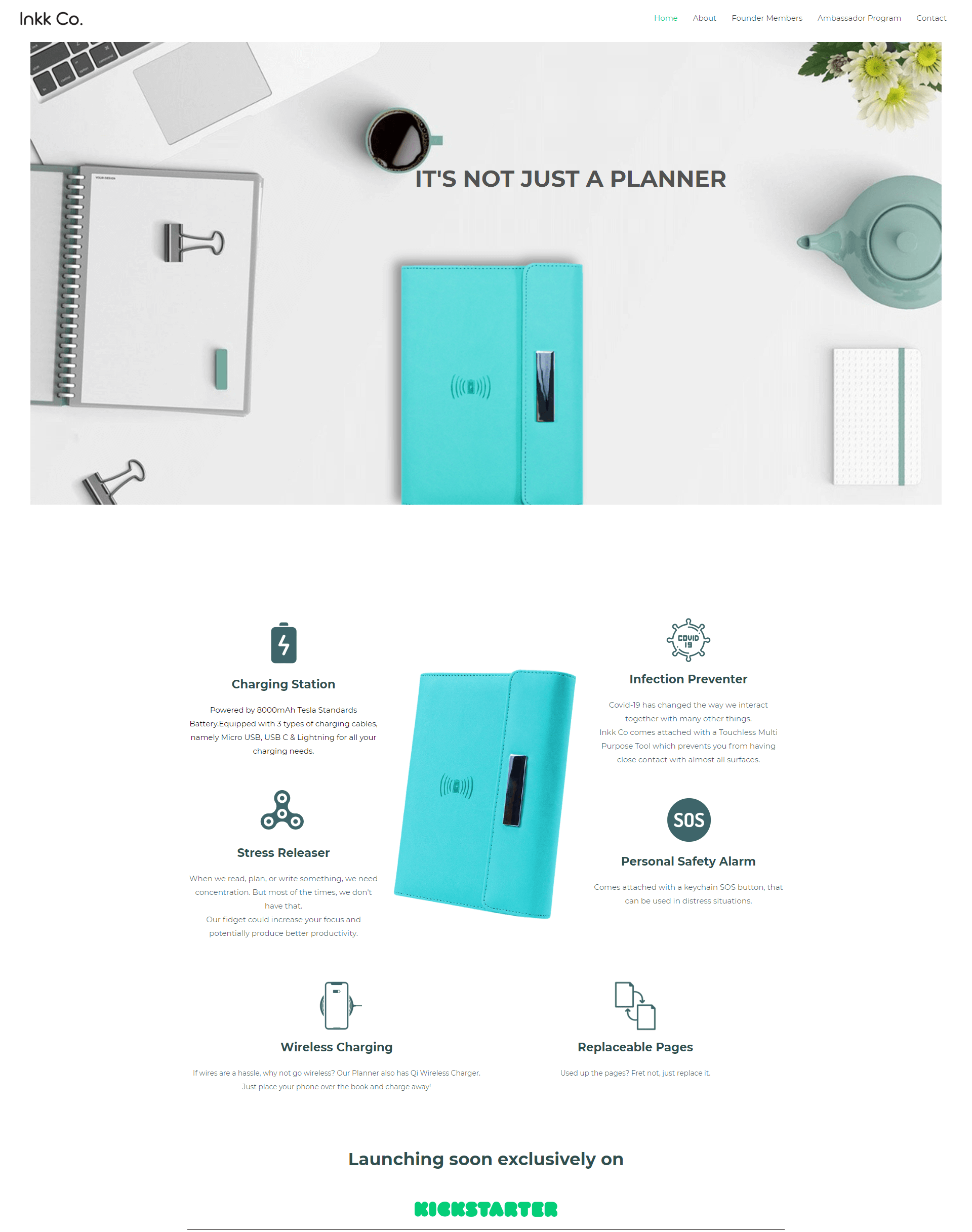
A unique approach to office organization, Inkk is a company responsible for making unique planners which not only manage your notes but also give you stress release tools, a charging station, and a personal safety alarm too.
Inkk immediately grabs your attention with the statement, “It’s not just a planner; it’s everything you need.” As you scroll through the landing page, the content bursts into life with animations and interactive elements. Every benefit of the product stands out as you explore the content, so it’s easy to see exactly what you’re getting.
The comment that Inkk’s planner is only available in “limited units” also helps to generate a sense of urgency among potential customers.
8. Rawkly

Unique apparel company Rawkly specializes in delivering headwear that’s a little different from the status quo. The company is currently offering its first product – a snapback cap with a wooden effect on the brim.
The first thing to grab your attention in this landing page has to be the unique headline, which features 3D-effect font to really draw the eye. Under that, there’s a countdown timer letting you know when the hat is going to go live on Kickstarter – great for building environment.
Rawkly offers a chance to win your own free snapback if you sign up as early as possible. Plus, the simple landing page doesn’t overwhelm users with too much information.
9. Salus
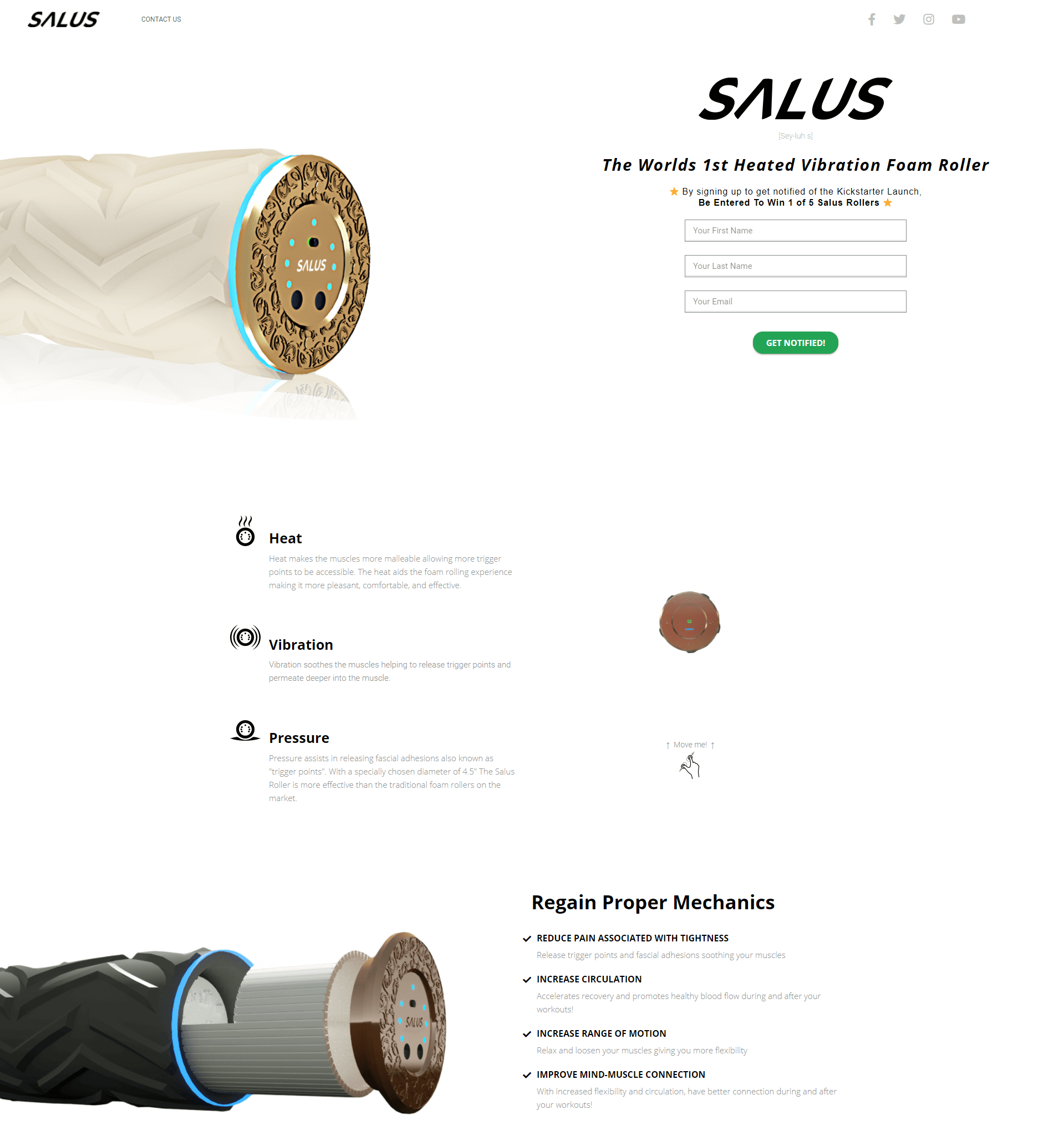
Salus is bringing the very first heated vibration foam roller to the world. The company aims to improve the way people deal with everyday pain and soreness by increasing circulation and boosting range of motion one roll at a time.
This fantastic landing page is simple but effective, with interactive elements to engage the user. You can interact with the graphic to make it bigger or smaller, and as you scroll down, you’ll see scrolling text, letting you know more about what the device can do.
With plenty of white space to avoid overwhelming the eye, Salus’s landing page is clean and eye-catching at the same time. The FAQ is great for getting more valuable information.
10. Zbole
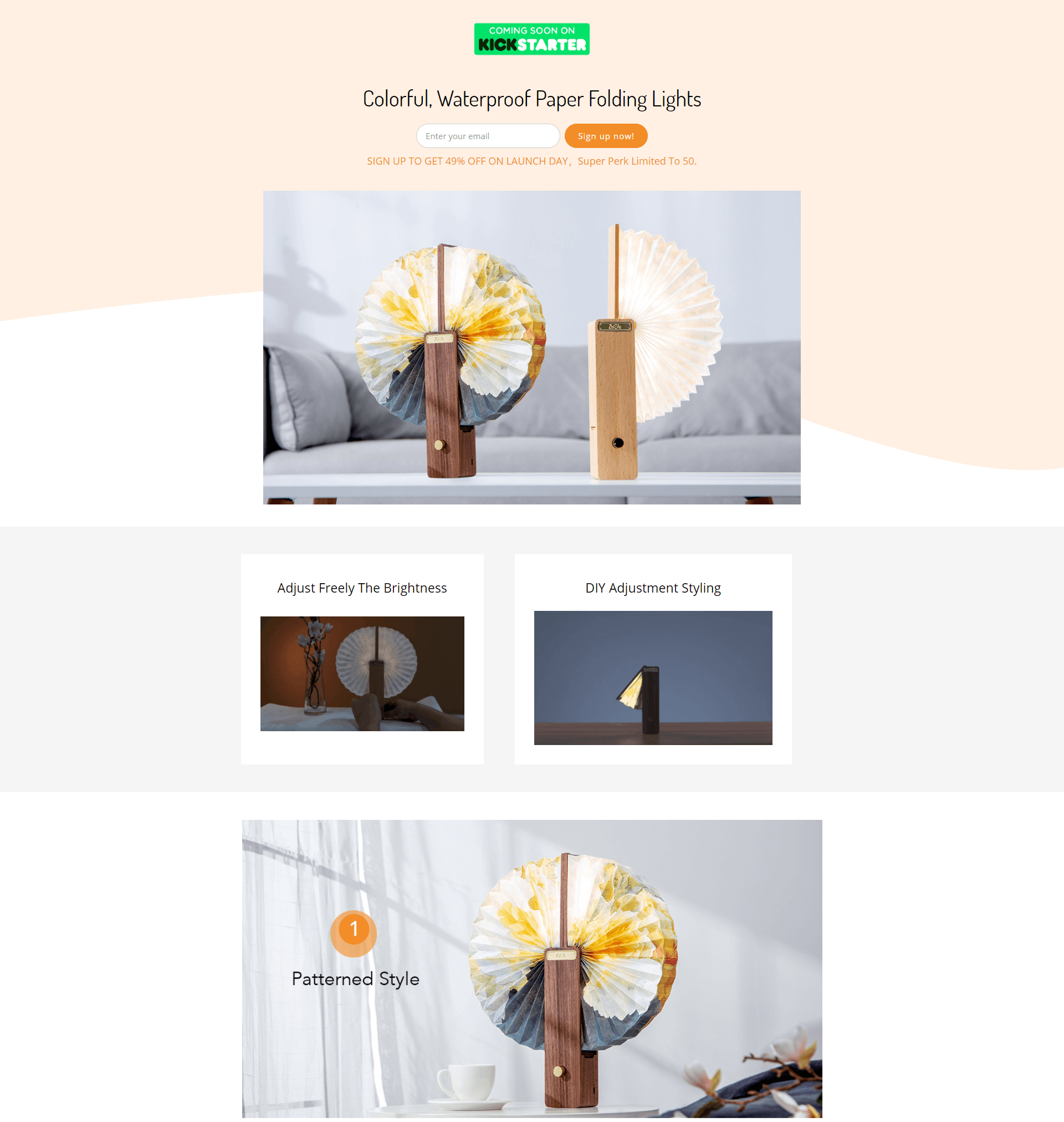
The Zbole brand is transforming the home lighting environment with unique pieces of furniture which immediately enhance any room’s appearance. The folding lights look similar to an Asian fan, with unique patterns to suit different rooms.
The landing page is packed full of visuals to show you how the lights work and to demonstrate the quality of the product. We loved the videos, and the images showing how users can change the position of the light. There are even GIFs showing how the products are made.
The “about” section is particularly appealing on this website, as it provides a behind-the-scenes look at the amazing elements of the lighting product. It’s great for convincing you to buy.
11. MoFinder
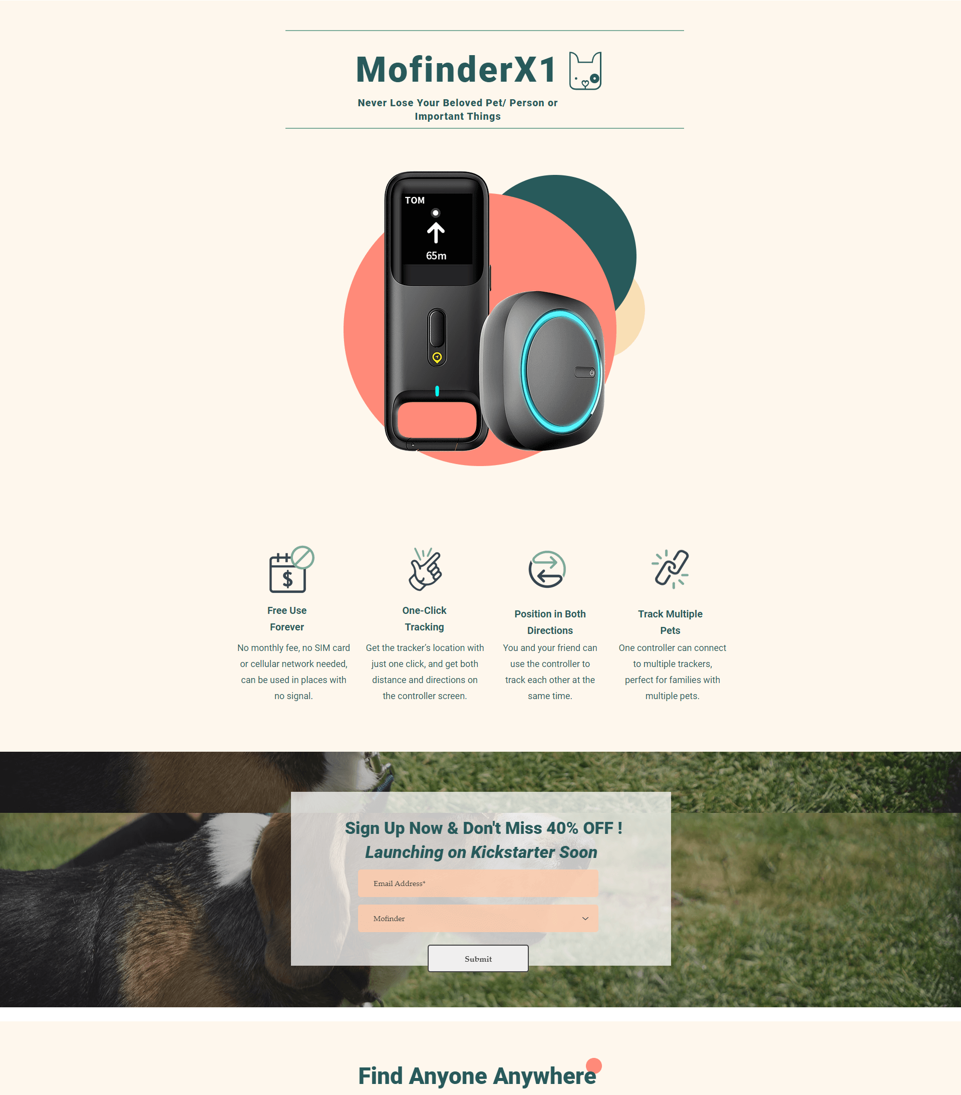
MoFinder is an organization helping to reduce the number of lost products, people, and even pets in the world today. The MoFinder X1 is the company’s flagship product, which makes it easy to track multiple pets and items on the go.
We love the beautiful design of this landing page, which immediately draws attention to the features of the product, and its unique benefits. As you scroll through the page, you get plenty of easy-to-read insights into what the device can do, along with engaging graphics and animation.
The call-to-action to sign up for the newsletter prompts people to enter their email address for a chance to get 40% off when they’re ready to purchase.
12. Vessel Athletics

The Vessel Athletics team are introducing a new way to upgrade your athletic experiences with the hydroshirt. This compelling product solves a genuine problem for runners and other outdoor adventurers by allowing them to carry water without the bottle.
The landing page gets straight to the point by showing you what the product does with a high-quality image. The headers and sub-headers showcase the value of the item instantly, with phrases like “ditch the extra weight.” As you scroll through the page, you’re met with plenty of helpful visuals to teach you more about the item.
We love that this landing page is simple, straightforward, but effective in highlighting everything the item can do.
13. Simply Paws
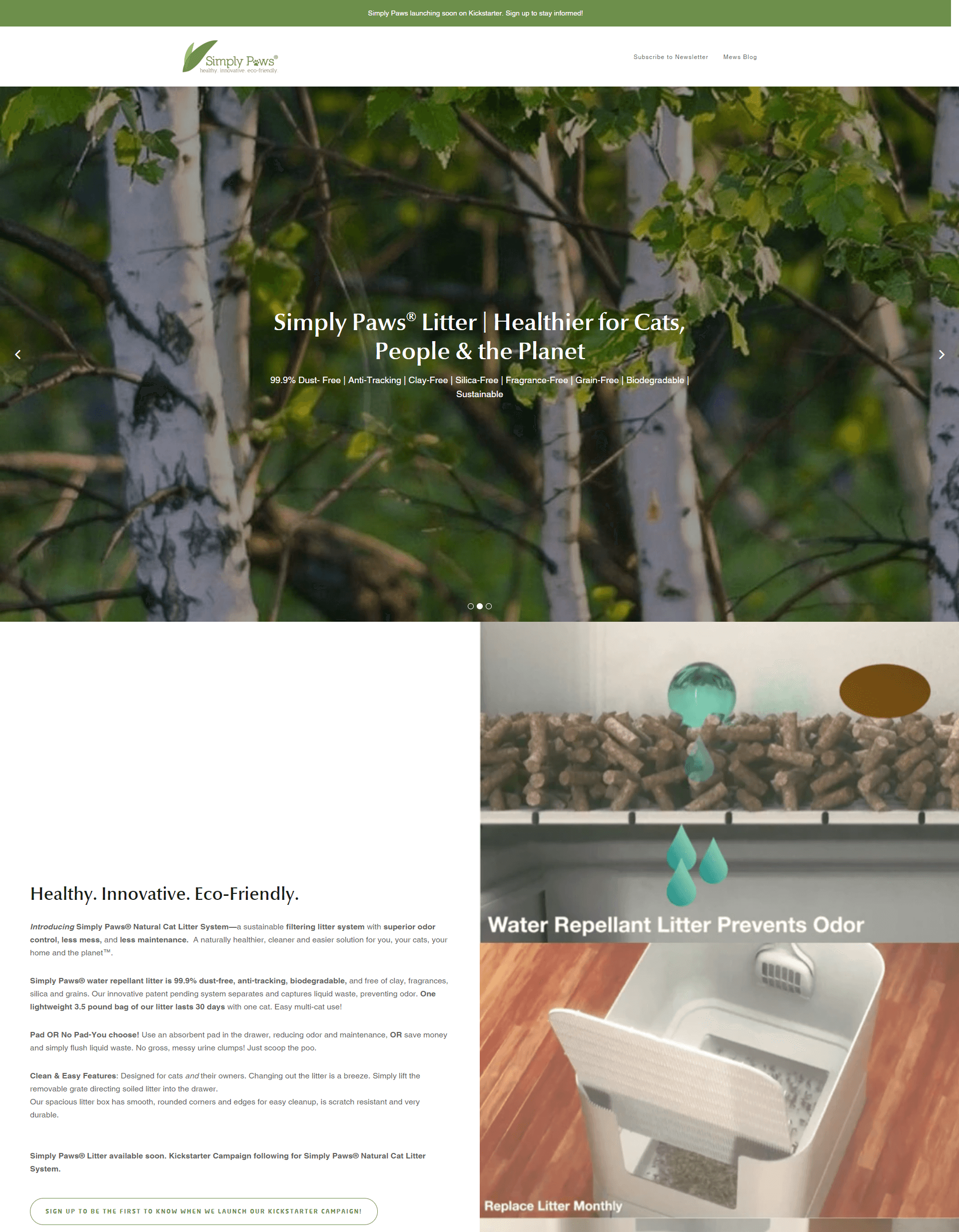
Simply Paws is a pet-focused company bringing eco-friendly solutions to the world of pet ownership. The Simply Paws litter system promises superior odor control, sustainability, and better management in one simple package.
The landing page here is packed full of moving slideshows to showcase benefits and information in a visually engaging way. Everything looks clean and neat, with plenty of whitespace to ensure you don’t feel overwhelmed by content.
Our favorite feature in this landing page is the slideshow of testimonials, generating social proof for the product and encouraging more conversions.
14. Somni Sleep
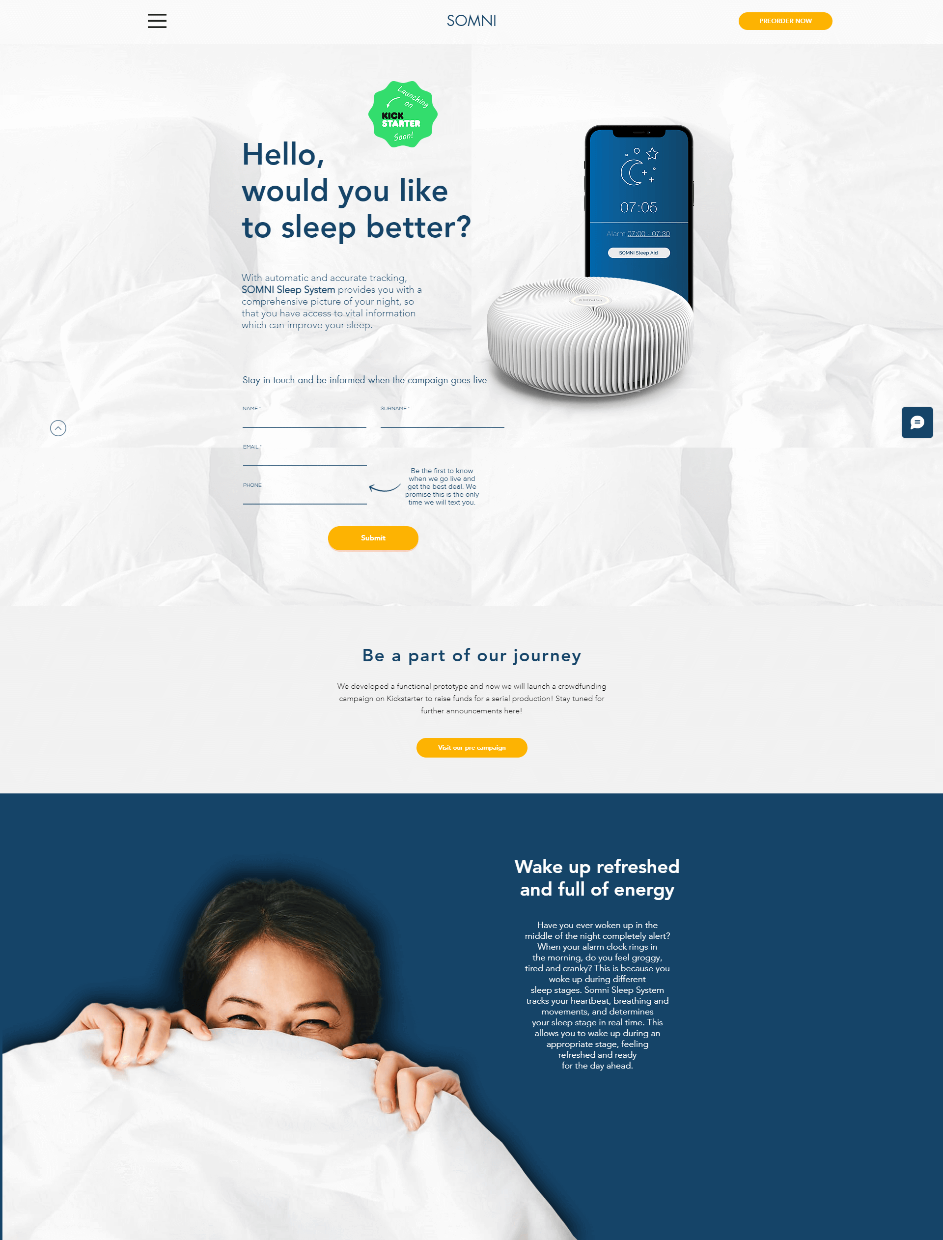
Committed to giving you a better night’s sleep, the Somni Sleep company promises a unique sleep system to help you understand your sleeping patterns. The device makes it easier to determine why you’re not sleeping soundly, so you can make valuable changes.
We love how clean and straightforward this landing page is. Everything looks professional, from the color coordination to the high-definition images. It’s easy to sign up and join the newsletter list, with form fields ready to go immediately. There’s no CTA button to take you to another page.
Somni Sleep have accomplished the perfect blend of high-quality visuals and informative copy in this landing page, so you get the best of both worlds.
15. Submerge
Submerge promises a wonderful way to upgrade your adventures on the waves. This wearable waterproof wallet protects all of your valuables when you’re swimming, surfing, or just hitting the beach.
Submerge’s beautiful yet simple landing page design immediately draws attention to the main benefits of the products without overwhelming the senses. The call-to-action button contrasts vividly with the rest of the page, promising a 20% discount to anyone who signs up.
There are multiple forms dotted throughout the page, too, so you can sign up further down if you decide to do so when learning more about the device.
Finishing thoughts
The right landing page helps to generate excitement and interest for an upcoming product on Kickstarter. If you want to make sure that your innovation gets the attention it deserves, a good landing page can help you to start cultivating your following.
Landing pages for Kickstarter campaigns are a fantastic way to create awareness around your new business. Hopefully, these Kickstarter landing page examples have given you some much-needed inspiration.


