So you recently started using Mailchimp huh?
If you are just starting to plan out your email marketing strategy with Mailchimp, chances are that the first email you will want to create is your welcome email.
Your welcome email is one of the most important emails you can send to your subscribers. Given that this is the first email your subscribers will get from you, it’s important that it stands out in your inbox, piques your subscribers’ interest, and makes an overall great first impression. After all, an amazing welcome email will keep your subscribers engaged with the following emails.
But what does a good Mailchimp welcome email look like in the first place?
We have you covered.
In this post, you can discover 17 Mailchimp welcome email examples from businesses and organizations that use the platform.
GoAbroad
Subject Line: ✈️ The World is Waiting. Welcome to GoAbroad

GoAbroad helps students find the right international program. According to their website, their mission was to “fill the information gap between students with a desire to travel abroad and companies offering international programs”. But it’s not just students they cater to. Over the years, their mission has evolved to serve as a resource and provide everyone with an opportunity for meaningful travel.
Their welcome email is simple and straightforward. It has a nice use of visuals within the email and the emoji in the subject line which make the entire email feel more personal and laid back.
Teltonika
Subject Line: Welcome to Teltonika Newsletter

Teltonika’s welcome email uses a cool graphic at the top that instantly catches your eye. The colors used in the email are completely on brand so there’s no mistaking who the email came from.
As far as the copy goes, Teltonika keeps it short and sweet. It offers two calls to action — one leading you to their latest articles and the second one leading you to relevant information about product updates. There’s also a tertiary call to action that invites you to explore their website.
Rich Roll
Subject Line: Unlock Your Best Self
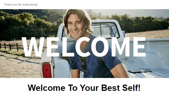
This Mailchimp welcome email example starts off with a smiling photo of Rich Roll which goes a long way towards building trust. He also shares a nice little story about himself and his motivation to transform his life.
In addition to that, he shares what you can expect from his newsletter and a free download to help you kickstart your personal Plantpower journey as he calls it.
The tone of the email is very personable and relatable which works well if you’re trying to build a personal brand. It establishes a connection and makes you feel like you’re getting emails from a friend rather than a corporate business newsletter.
Robo
Subject Line: Welcome to the Robo family
Robo is a California-based company on a mission to help people bring their ideas and creations through life. They sell 3D printers and printing materials, accessories, and educational materials.
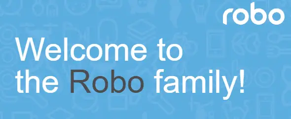
Their welcome email uses a simple branded design that matches the rest of their website. You get a little behind-the-scenes story of how the company got started and a nice little coupon paired with a call to action. This encourages people to go check out their website and make a purchase.
They also offer a few different ways for getting in touch with them, in case you have any questions about their products.
Search Engine Journal
Subject Line: Thanks for subscribing to SEJ’s newsletter list!
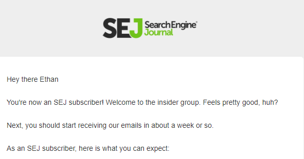
Search Engine Journal does a great job of keeping their welcome email simple, to the point, and informative. It clearly informs you what you can expect from the newsletter. It also links to various parts of their website along with a nice call to action inviting you to download their ebooks.
Their second email is a part of the welcome series and smartly prompts you to move their email to your inbox instead of letting it land into your promotions tab. This is a good tactic to increase your open rate and ensure your subscribers actually see and read your emails. In addition to that, their second email also prompts you to update your preferences to ensure you’re receiving content you’re truly interested in.
Liverpool Bid Company
Subject Line: Thanks for signing up!

The Liverpool Bid Company has a very cool welcome email design that matches their brand and their website to a T. The company is a private, not-for-profit limited company that represents 1500+ BID Levy Payers in Liverpool across two BIDs (Business Improvement Districts): Retail & Leisure BID and Culture & Commerce BID.
Their email starts off with a welcome and then transitions into what you can expect from their emails as well as how often you’ll get them. They wrap up the email with a call to action that invites you to stay up to date by visiting their website.
Stockcharts
Subject Line: Welcome to ChartWatchers!

Stockcharts has a simple and clean welcome email design. What sets them apart is the fact that they named their newsletter which makes it recognizable and memorable. Overall, the design uses a similar color palette as their website which is a good way to build brand recognition.
As far as the email itself goes, they give you a brief overview of what you can expect from the newsletter. They also list the benefits of becoming a premium member and prompt you to start a free trial right away.
Engaio Digital
Subject Line: Thanks for joining us

Much like their website, the welcome email sent by Engaio Digital is clean and minimal. They opted for a cool font choice that resembles typewriting and gives the entire email a more personal feel.
What makes this email interesting is the prompt for subscribers to submit content to be featured in their newsletter. This isn’t super common but it can be a great way to source content to share with your audience. Plus, there’s a clear benefit for the subscribers as well. It not only puts their business in front of more people but it also increases their reputation and trust.
Aegle
Subject Line: The healthier you starts here

Aegle has a very visual welcome email. For starters, there’s an envelope at the top with a welcome message and a coupon to use during your next visit. Immediately after that, you can click images to visit relevant pages on their website and learn more about their treatments as well as their team.
The email then concludes with a subtle prompt to follow them on social media and share your experience by using their branded hashtag. Overall, this welcome email packs a lot of content and several calls to action. However, because of the way that information is presented, it’s not overwhelming for the subscribers.
Pennington Creative
Subject Line: It’s Time To Get Creative
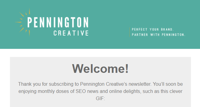
A welcome email from Pennington Creative is sure to stand out in your inbox because of the animation. It immediately catches your eye and makes the email (and the company as a whole) more memorable.
The email has a simple design that’s not overwhelming. It tells you what you can expect as well how often you’ll receive their emails. In addition to that, it gives you a small call to action prompting you to download their eGuide. This is a great way to get a micro conversion from your subscribers and get them to click on the buttons or links in future emails.
eLearning Industry
Subject Line: Welcome On Board

This email by the eLearning industry starts off with a photo of a smiling couple and balloons indicating their excitement and happiness. It immediately sets the tone for the email and makes you excited for signing up.
Similarly to other emails on the list, they tell you immediately what you’ll get access to as a subscriber. In addition to that, there’s a bright call to action in the email to update your preferences. They certainly understand the importance of delivering relevant content in order to nurture their target audience and ensure they’re getting information they’re most interested in.
K&W
Subject Line: Your $5 Off Coupon

The K&W email has a bright design with a photo of one of their locations and the food they serve. The email includes a short welcome message and a large coupon code that you can use to get $5 off your next order. The coupon is included in the subject line too so there’s no way to miss it. The email also spells out the terms and conditions for the coupon in a concise manner and tells you how to use it.
They wrap up the email with a prompt to find their nearest location which subtly encourages you to visit them in person.
Stretch and Flex
Subject Line: Thanks for signing up!

Here’s another simple and to the point welcome email from Stretch And Flex. They start off the email with a photo of a yoga mat and transition into a short, welcoming blurb.
After that, they give an overview of what you can expect from their emails and invite you to check out their website and class offerings. A brief explanation of different types of classes and a call to action to book a class is a good way to encourage subscribers to take action immediately and “trains” them to click on the buttons and links in future emails.
The Happiness Planner
Subject Line: Welcome to The Happiness Planner!

The Happiness Planner incorporates a photo of the founder which goes a long way towards making the email feel more personal. Out of all the emails on this list, this is the longest welcome email but that doesn’t mean it’s bad.
On the contrary, there’s lots of subject matter to discuss and the contents do a great job of explaining it without making it feel overwhelming. In the end, there are two calls to action inviting you to shop the planner collection or download the accompanying app.
Bible Study Tools
Subject Line: Welcome to BibleStudyTools.com – Let’s Get Started!
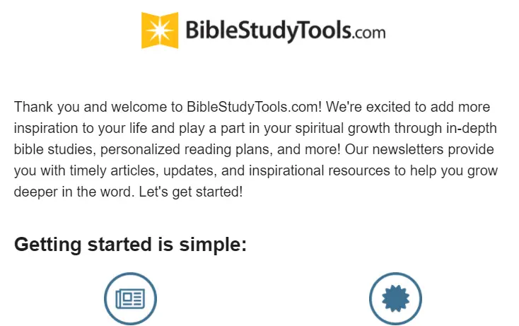
At first glance, this welcome email seems short. But once you take the time to read it, you’ll notice it’s full of prompts asking you to take action. For starters, they tell you what to expect. Secondly, there are several links that you can click to update your preferences, check out the latest articles, and follow them on social media.
Lastly, there’s also a short prompt to add them to their address book to prevent their emails from going to spam or ending in the Promotions tab.
Southern Bite
Subject Line: 👋 Welcome! I’m Stacey and this is Southern Bite!

If you’re looking for an example of a welcome email that’s super personable and genuine, this is it. Stacey uses an engaging copy that sounds like he’s talking to a new friend he just met. He shares tidbits of personal information that make him relatable and instantly make the subscribers feel like they know him.
Another thing that sets the email apart is the prompt asking subscribers to reply and talk about themselves. He also encourages you to add him to contacts to avoid landing in the promotions tab and shares the link to his free cookbook.
Charity Navigator
Subject Line: Welcome to Charity Navigator!
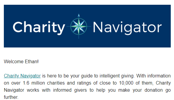
The Charity Navigator gives a concise overview of the organization and has a bold call to action that takes subscribers immediately to the site so they can find charities to support. It catches the attention as soon as you open the email which is exactly what a good call to action should do.
Aside from that, the email has a nice and clean design that matches the rest of their brand and website. There are also a couple of other links that point to different sections on the website as well as a P.S. that prompts them to email them if you have any questions about their services.


3 Responses
I like what you guys are up too. This kind of clever work and
exposure! Keep up the great works guys I’ve incorporated you guys to my personal blogroll.
Simply want to say your article is as surprising. The clarity in your post is just nice and i can assume you’re an expert on this subject.
Well with your permission let me to grab your feed
to keep up to date with forthcoming post. Thanks a million and please carry on the gratifying
work.
Heya just wanted to give you a quick heads up and let you know a few of the images aren’t loading properly.
I’m not sure why but I think its a linking issue.
I’ve tried it in two different internet browsers and both show the same results.